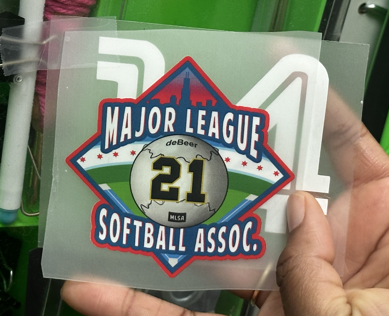
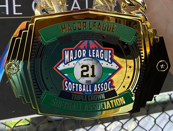
BRANDING / PATCH DESIGN
The Patch Is Where The Culture Lives.
The league needed a bold patch illustration system that feels athletic, recognized, and flexible enough for both digital and physical use.
CLIENT
Major League Softball Association
ROLE
Illustrator / Brand Designer
YEAR
September 2021


01 / OVERVIEW
Culture Is the Heartbeat of Sportsmanship.
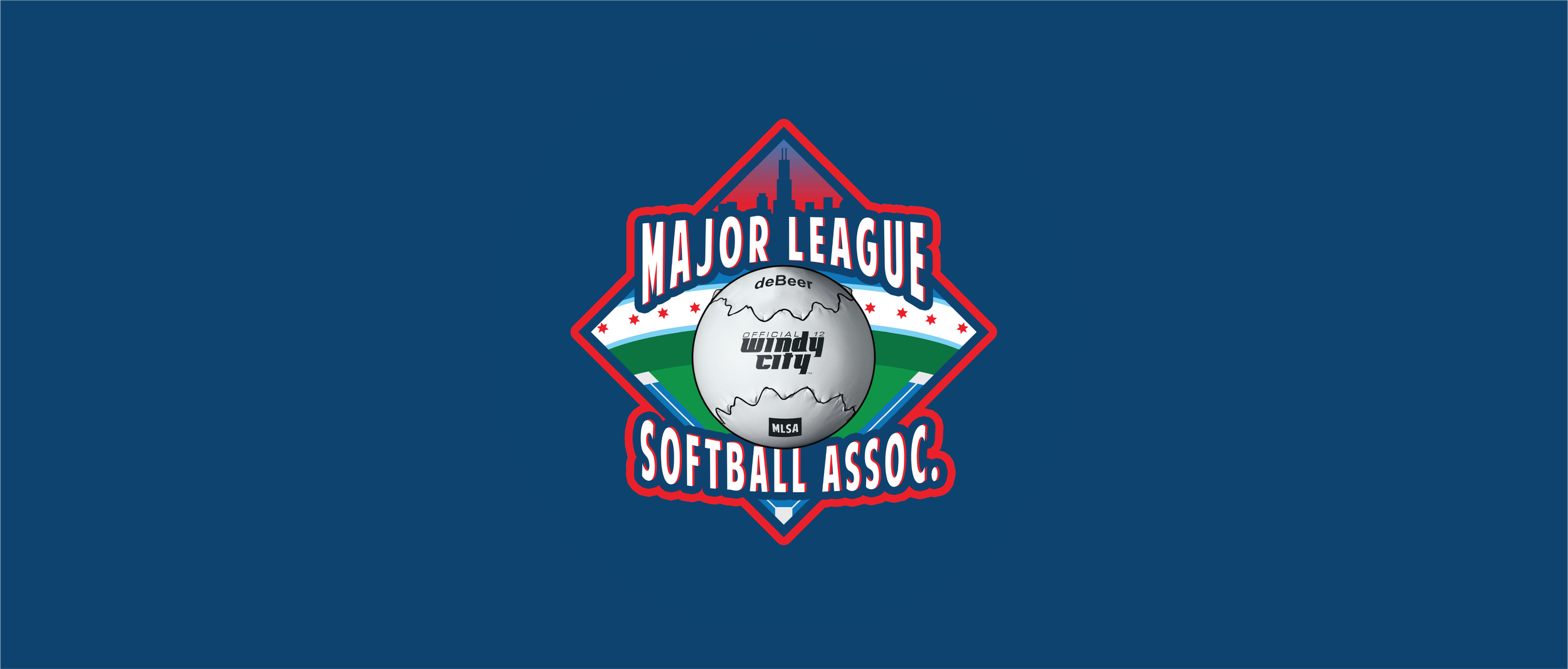
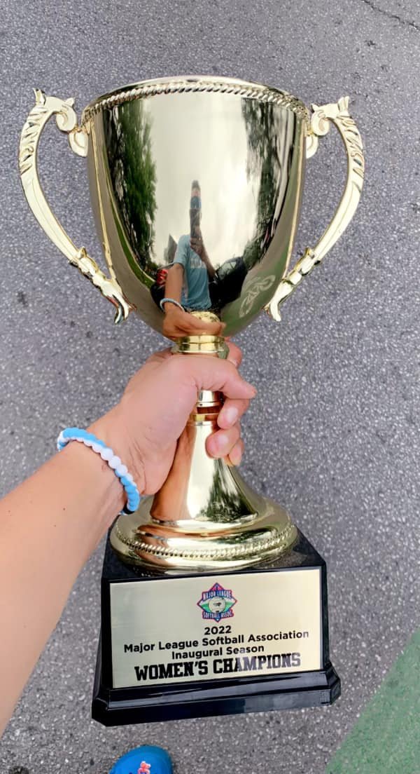
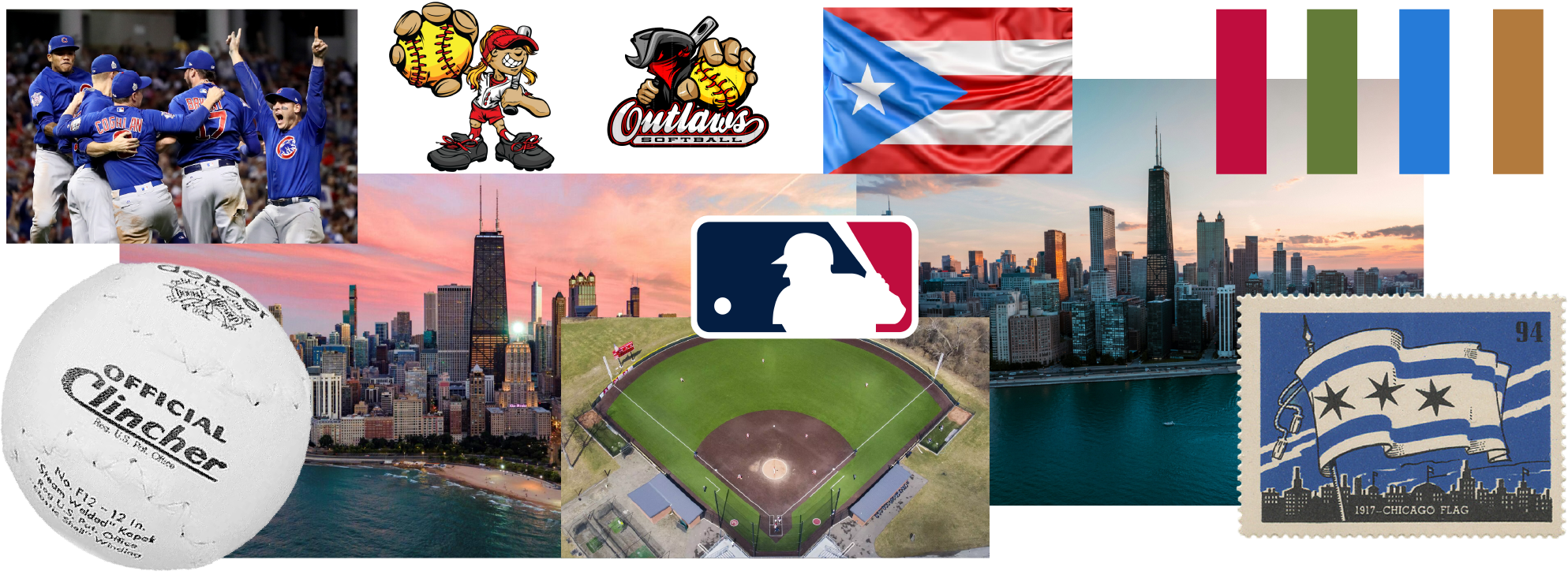
The Major League Softball Association is a Chicago-based non-profit bringing softball opportunities to players of all ages and backgrounds. As the organization grew, so did the need for a visual identity that truly reflected its community, not just the sport.
The goal was to design a patch system that wove together Chicago's iconic city culture, Hispanic heritage, and the spirit of softball into one unified mark, something players and fans could wear as a badge of pride.
02 / VISUAL RESEARCH
Mood Board
03 / SKETCHES
1st Place
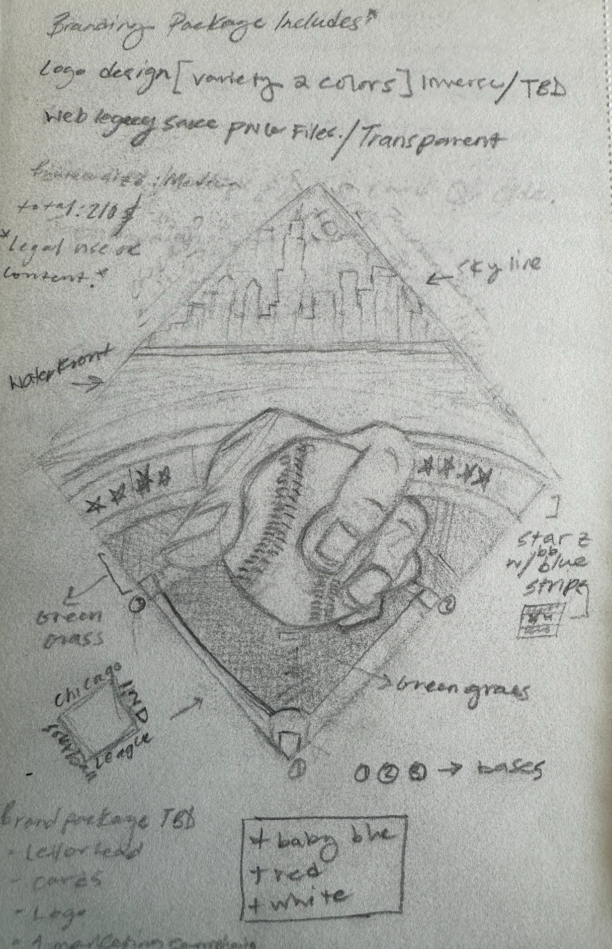
2nd Place
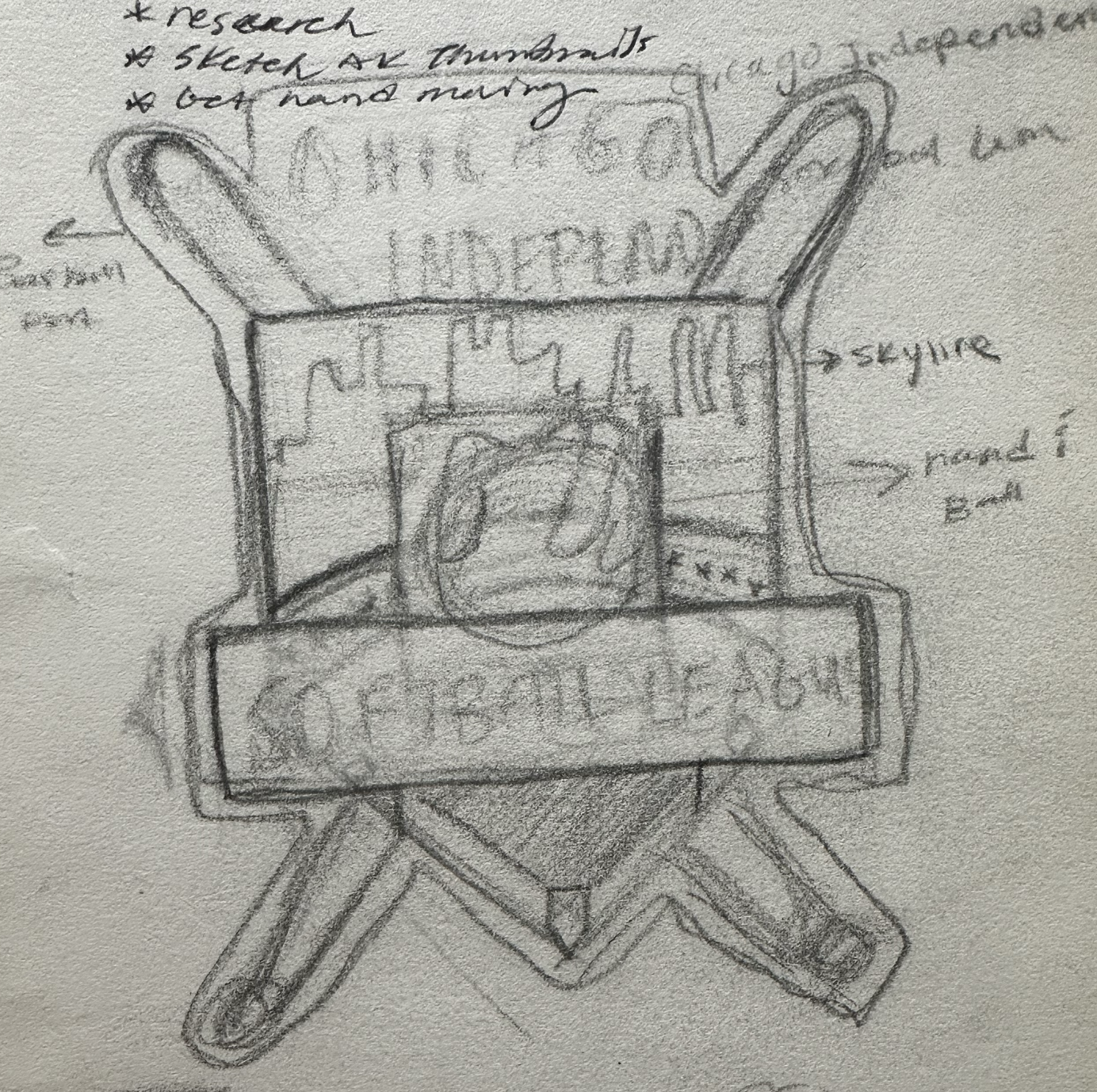
3rd Place

04 / TYPOGRAPHY

05 /COLOR PALETTE
#ec1d27
#0e76bc
#0e4270
#2E1937
#020407
#F6F6F6
Primary
06 / LOGO
Primary Logo