BRAND IDENTITY
Candle Soda A Legacy Brand, Reimagined.
A modern brand identity redesign for a 75-year-old probiotic soda company preparing for national expansion
CLIENT
Candle Soda
YEAR
May 2024
ROLE
Brand Designer
01 / OVERVIEW
Rooted in Heritage. Built for Today.
Original Logo

Candle Soda has been crafting probiotic drinks since 1949. As the brand prepared for a new generation of wellness-minded consumers, it needed an identity that honored its legacy while feeling fresh, trustworthy, and relevant.
The goal was to modernize the visual identity, create a cohesive brand system, and build a foundation that could scale across packaging, apparel, and digital.
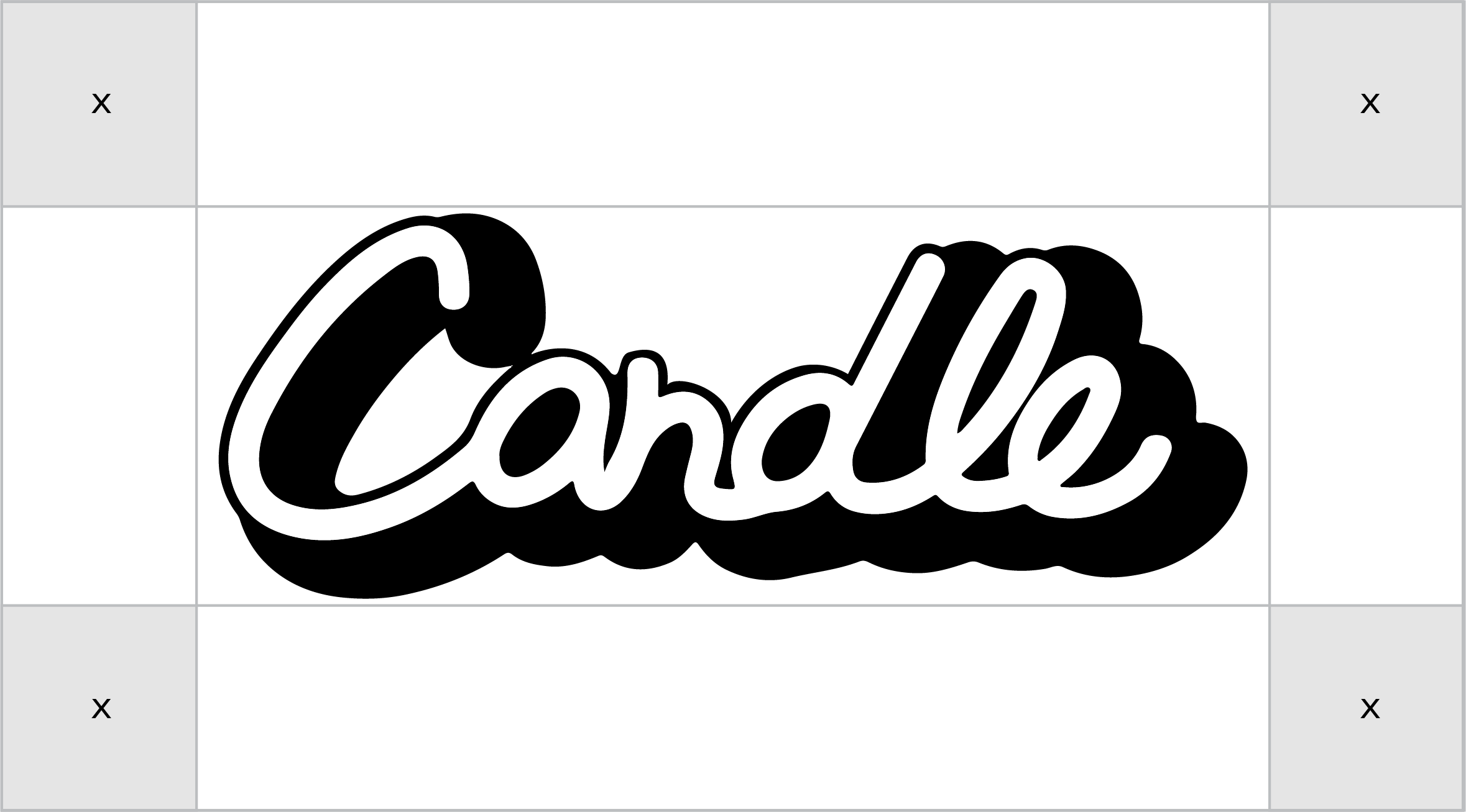
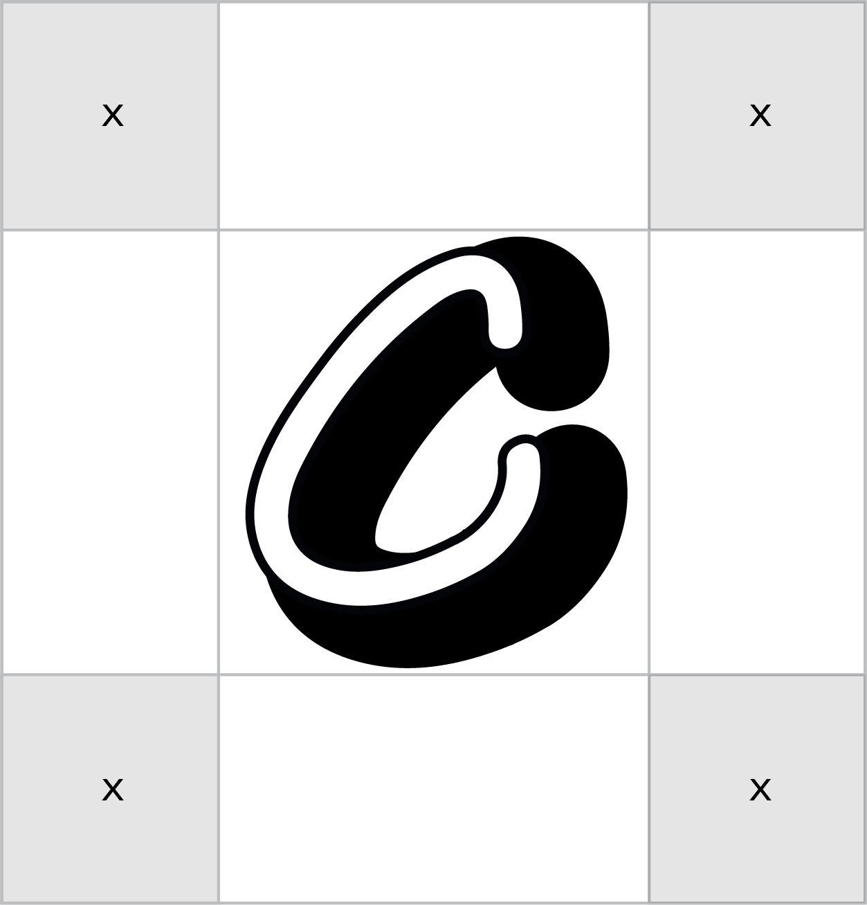
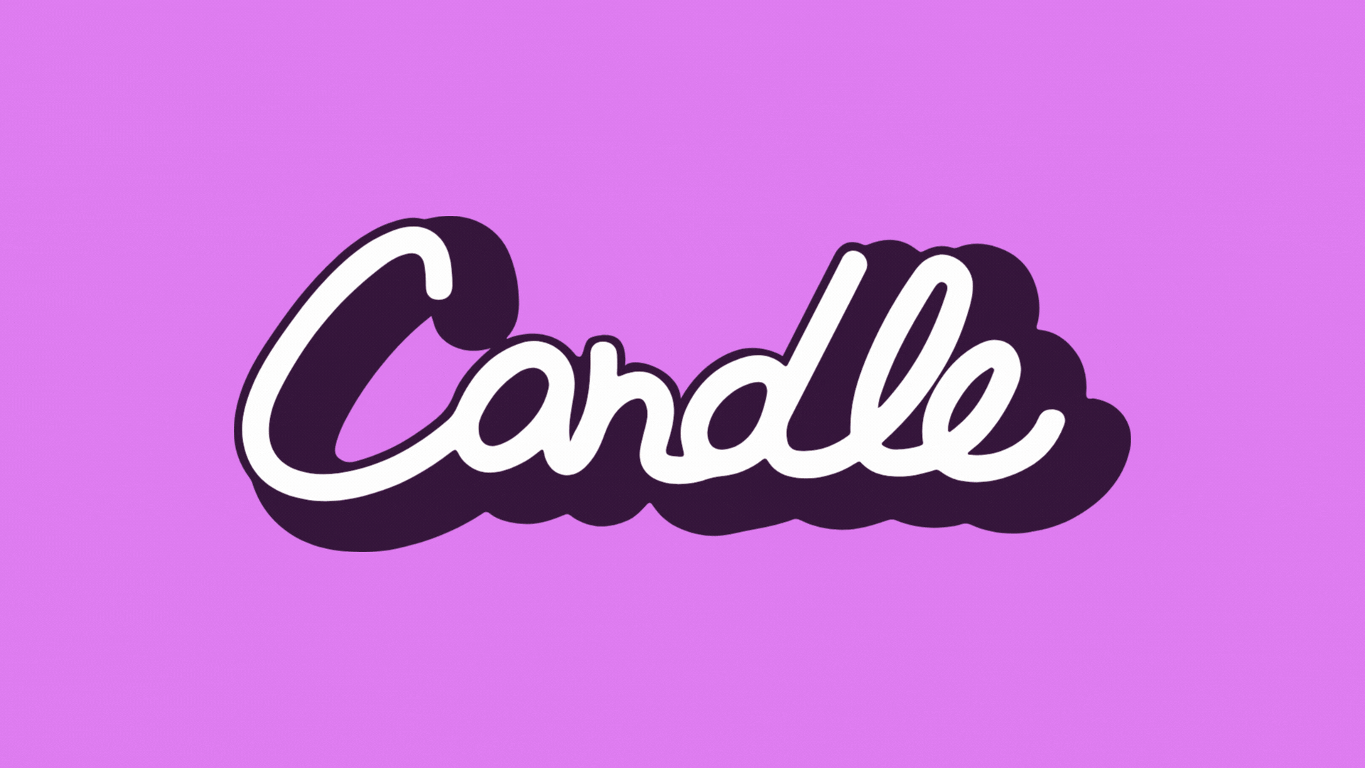
02 / LOGO REDESIGN
Primary Logo
Secondary Logo
03 /COLOR PALETTE
#D181EA
#C6D866
#3D894E
#2E1937
#020407
#F6F6F6
Secondary
#1C321C
#C03531
#4B2528
#DE7F39
#C78C3F
#472A18
Primary
04 / TYPOGRAPHY

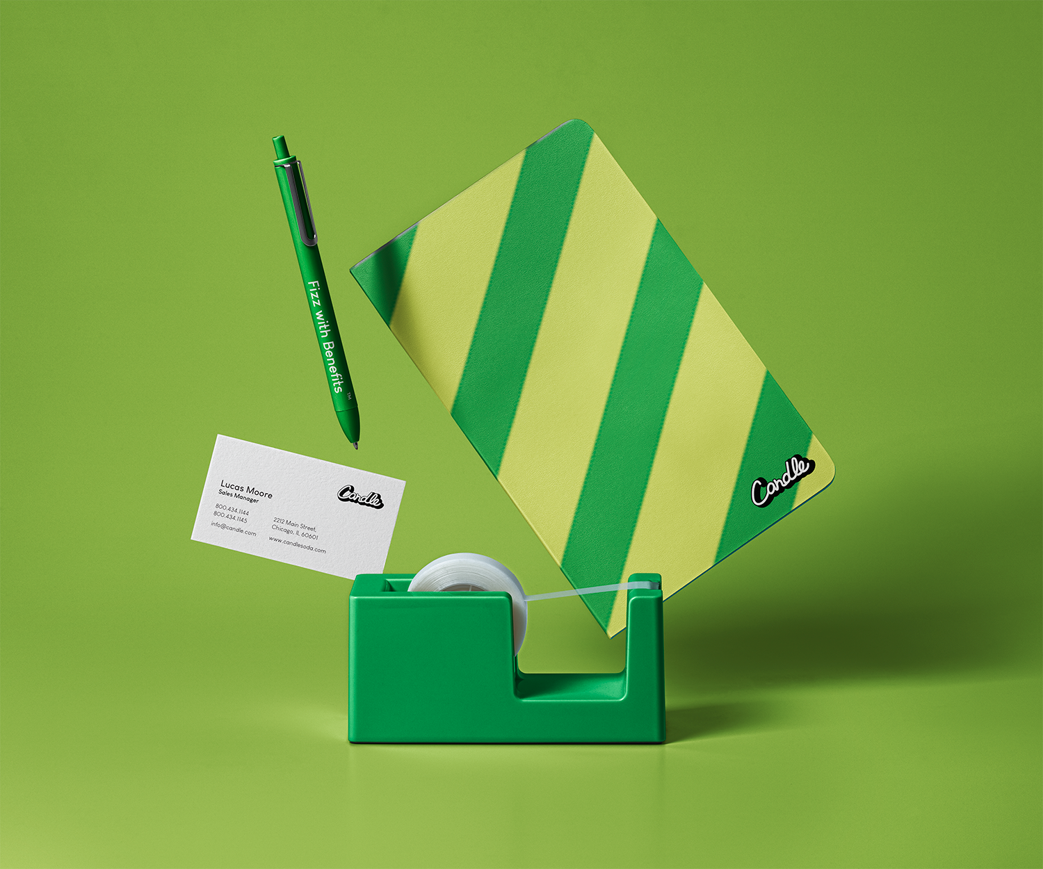
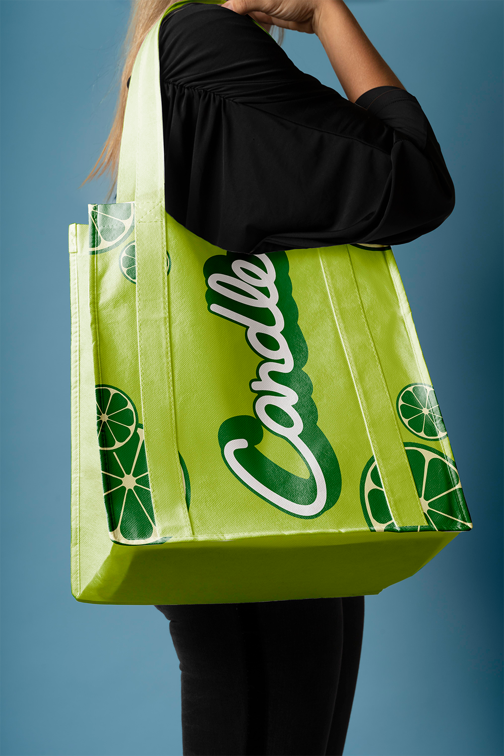
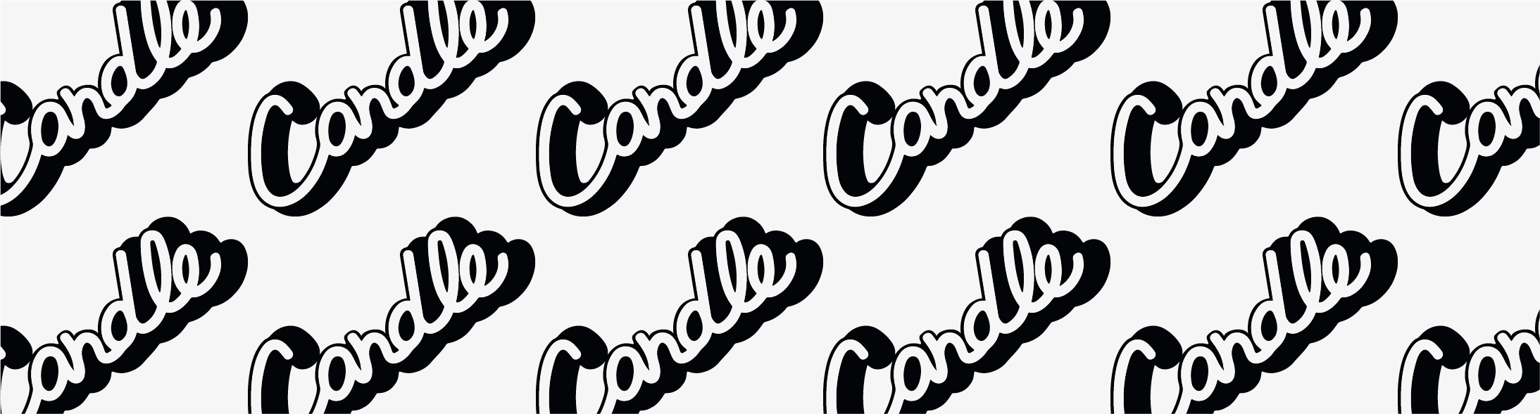
05 / BRANDING ELEMENTS
PATTERNS


ICONS


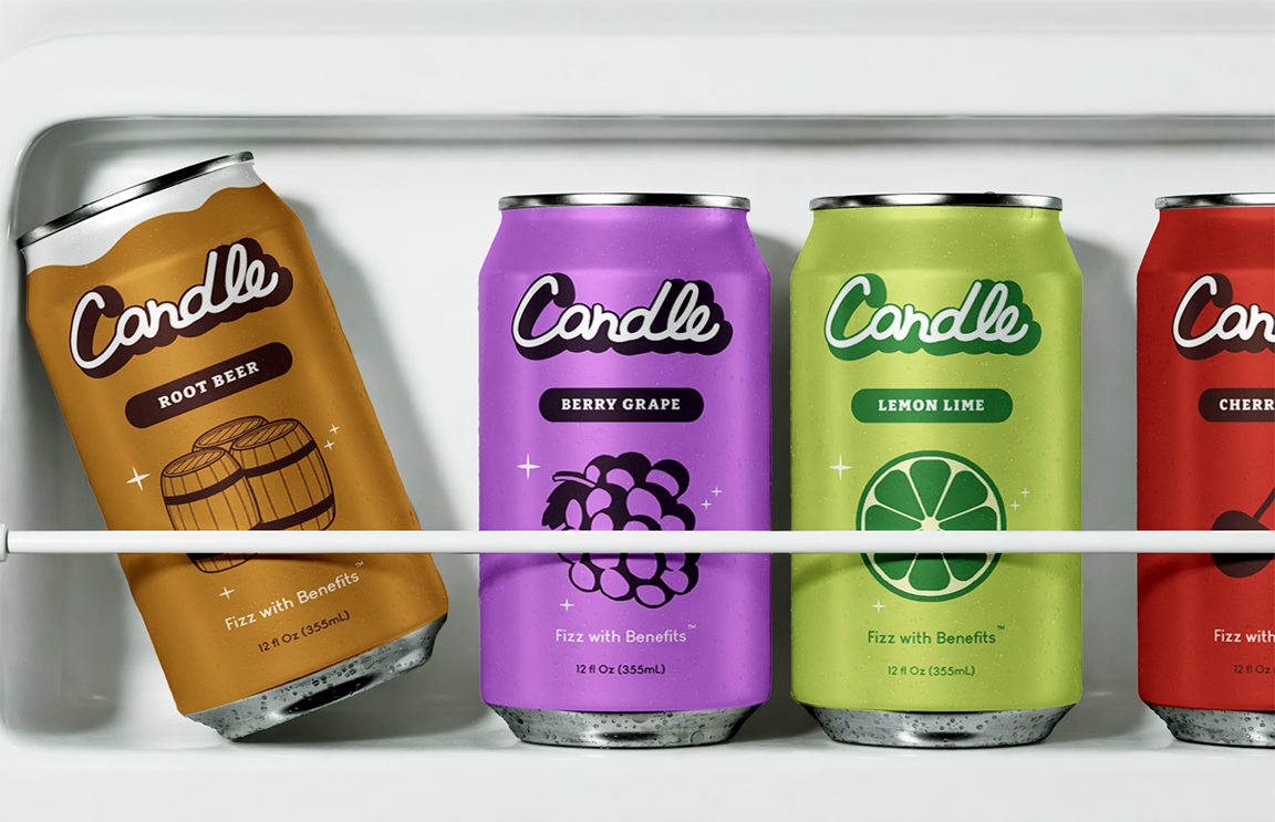
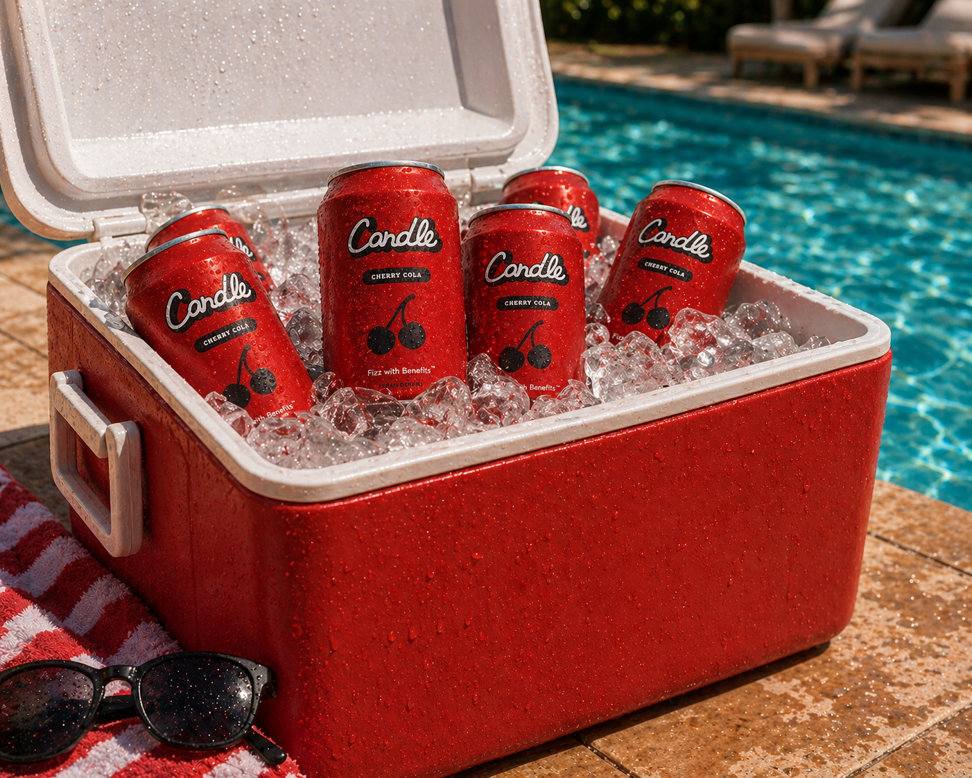
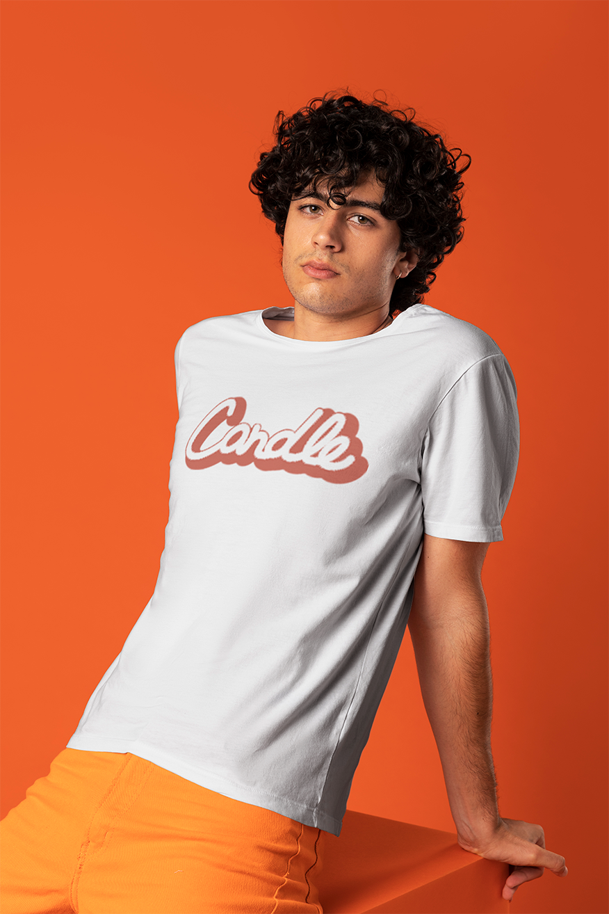
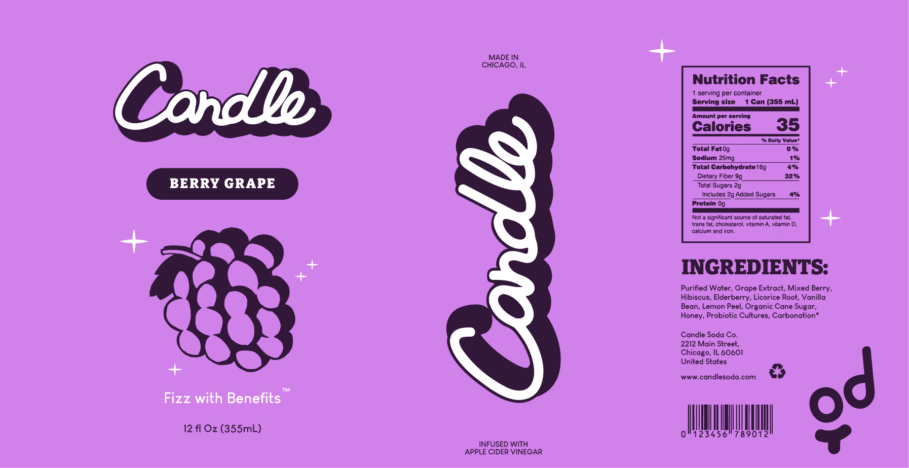
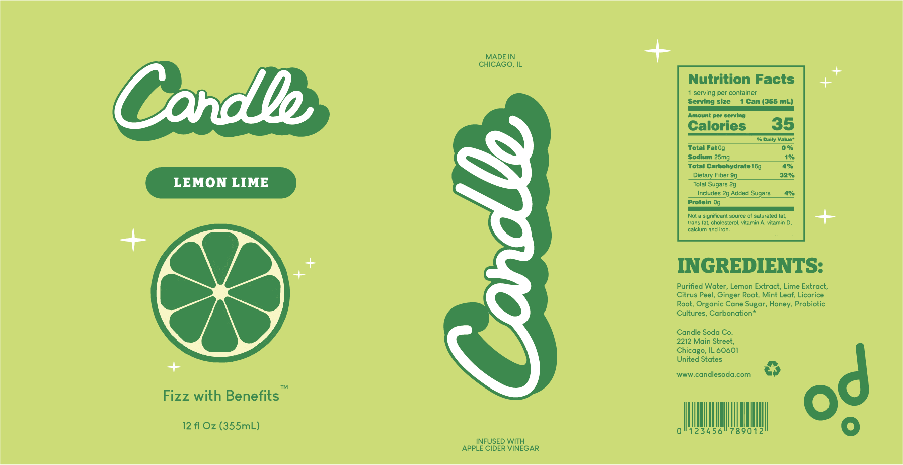
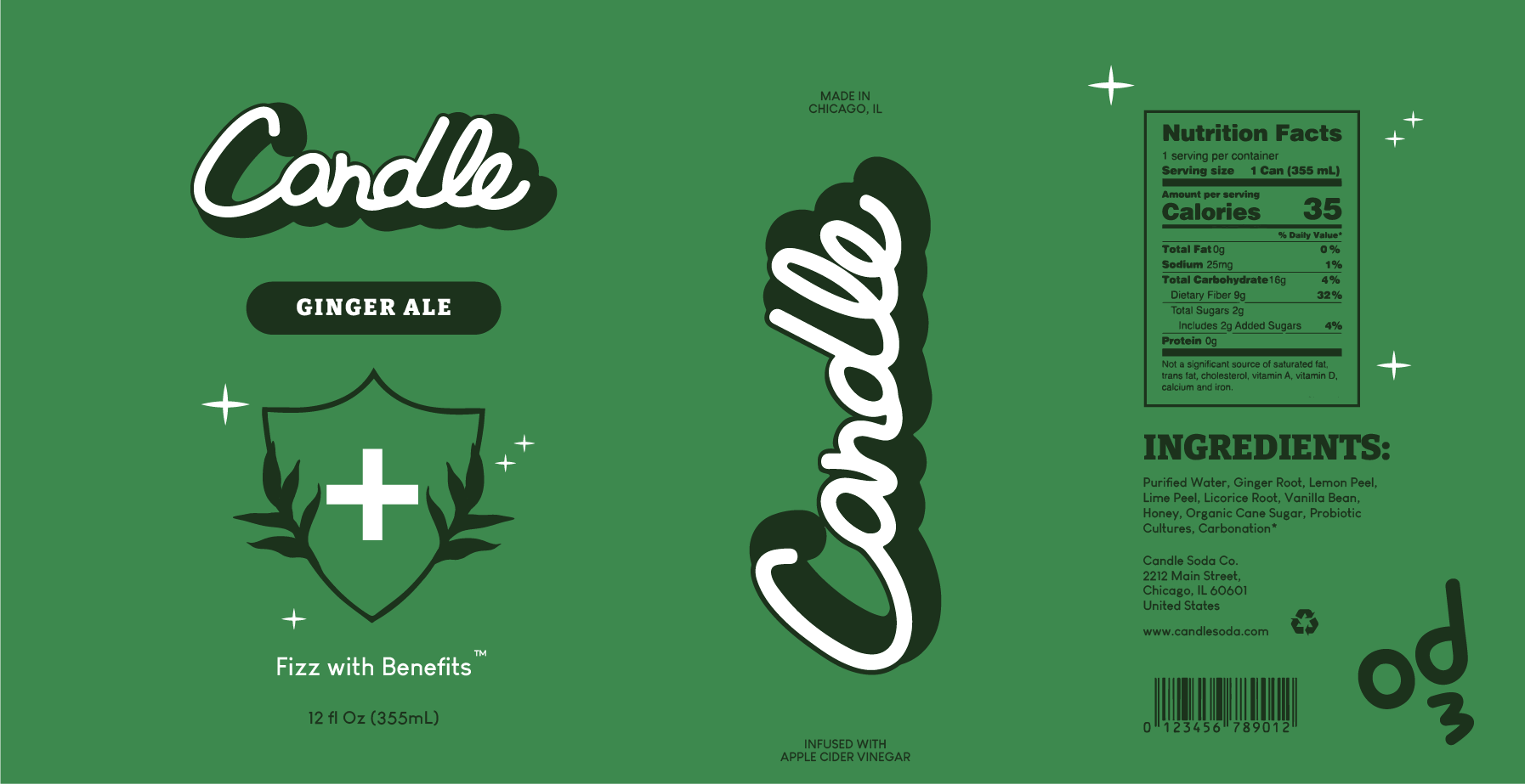
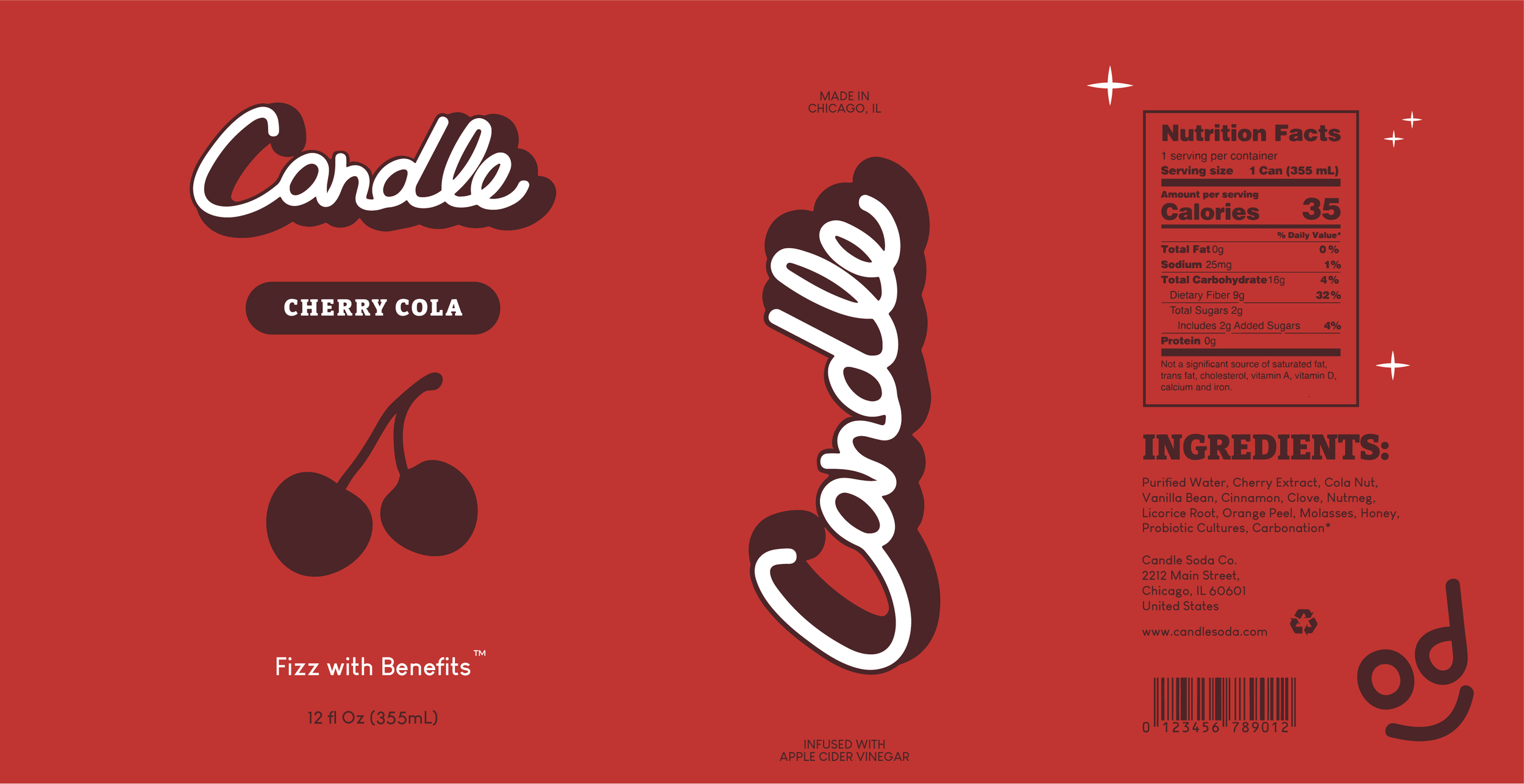
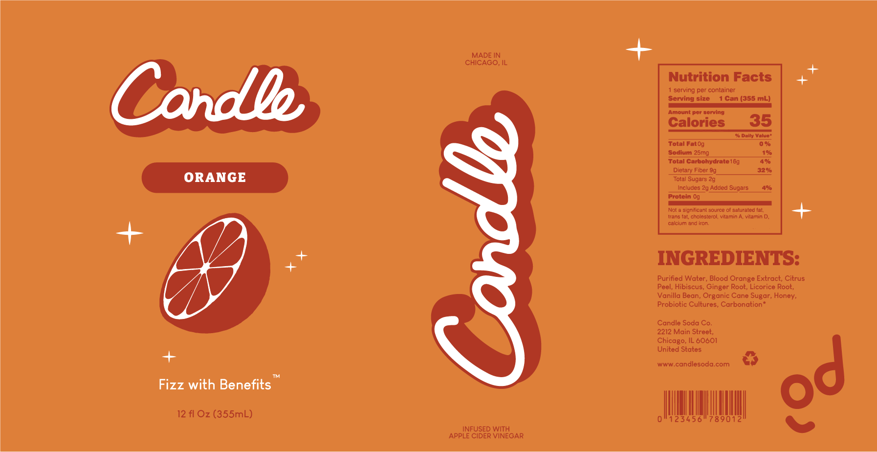
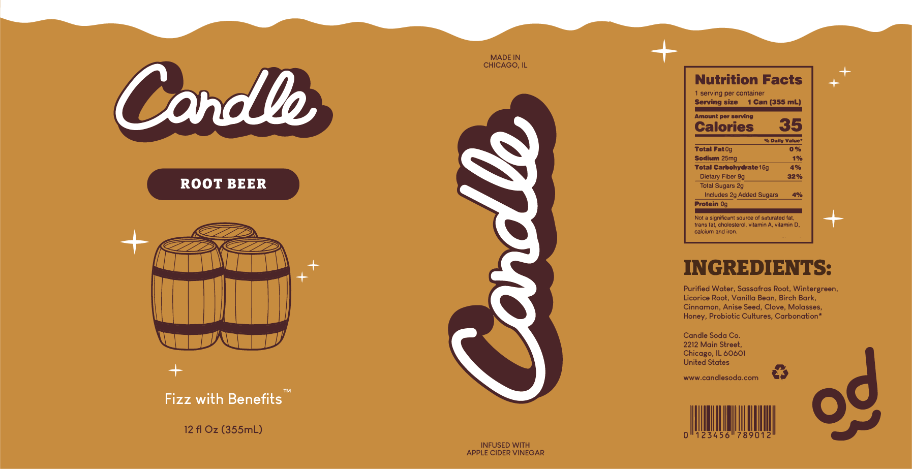
06 / PACKAGING
12 OZ ALUMINUM CANS
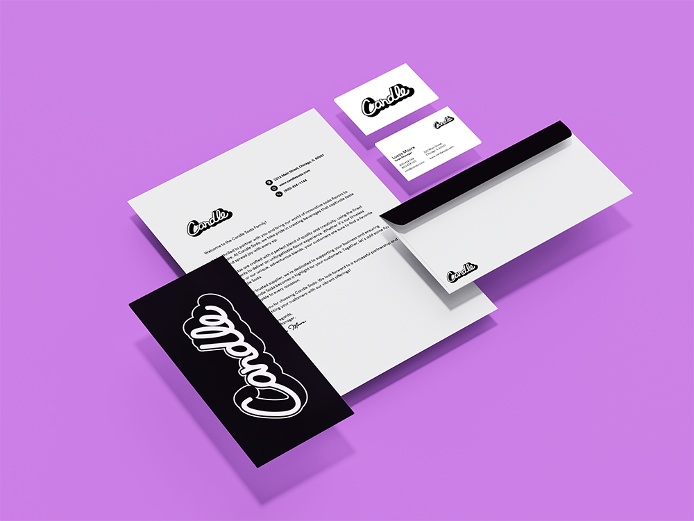
07 / STATIONARY