

What if pricing your freelance work wasn't a guessing game?
Overview
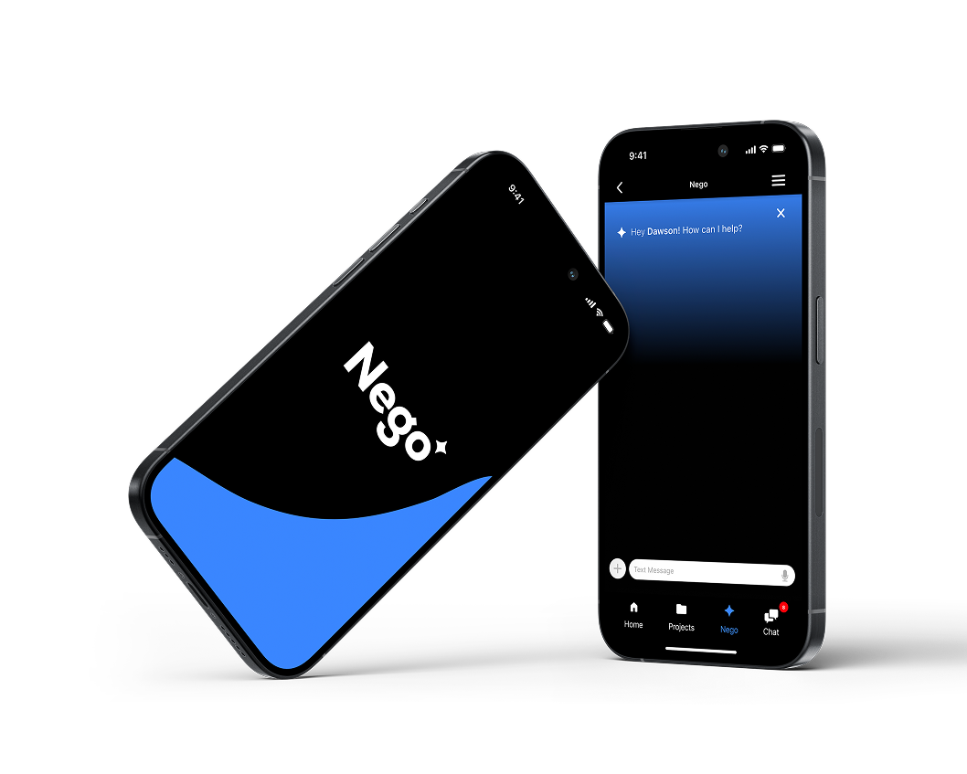
Nego is an iOS app for freelancers who know their craft but second-guess their price. It pairs project intake and invoicing with an AI assistant that helps freelancers review requests, weigh a budget against the real effort, and explain their rates to clients with confidence.
Most invoicing tools start with the invoice. Nego starts with the negotiation.
TIMELINE
One semester · Spring 2025
UXIN-614, Interactive Design for Mobile
ROLE
Sole designer & researcher
interviews → hi-fi prototype
SCOPE
8 core screens, one iOS flow
Crazy 8s → hi-fi prototype
IMPACT
3 of 3 testers
saw real value in the concept
The Challenge
Pricing creative work is hard.
Every freelancer eventually has to put a number on an invoice — hourly rates, retainers, one-time fees, revisions. Without a clear rationale behind that number, designers undercharge, then struggle to defend it when a client pushes back.
Most invoicing tools assume you already know what to charge. But the hardest part often happens before the invoice: deciding what the work is worth, and saying it with confidence.
Approach
My approach combines User-Centered Design (UCD) and Design Thinking. I started from my own problem — not knowing how to price client work — and tested whether other freelancers felt it too.
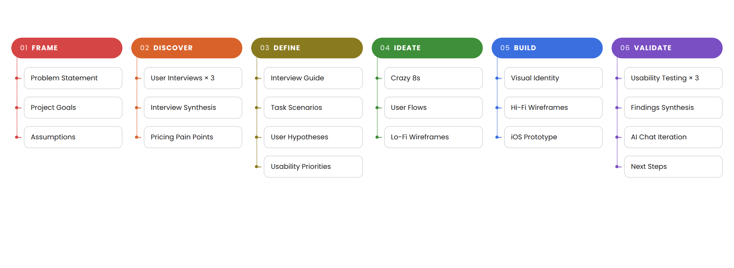
With one semester to research, design, and test, I kept the scope tight: one flow for reviewing a project request and negotiating its value. Here is the scope of my approach.
Primary Research
01
02
03
04
Interview Planning
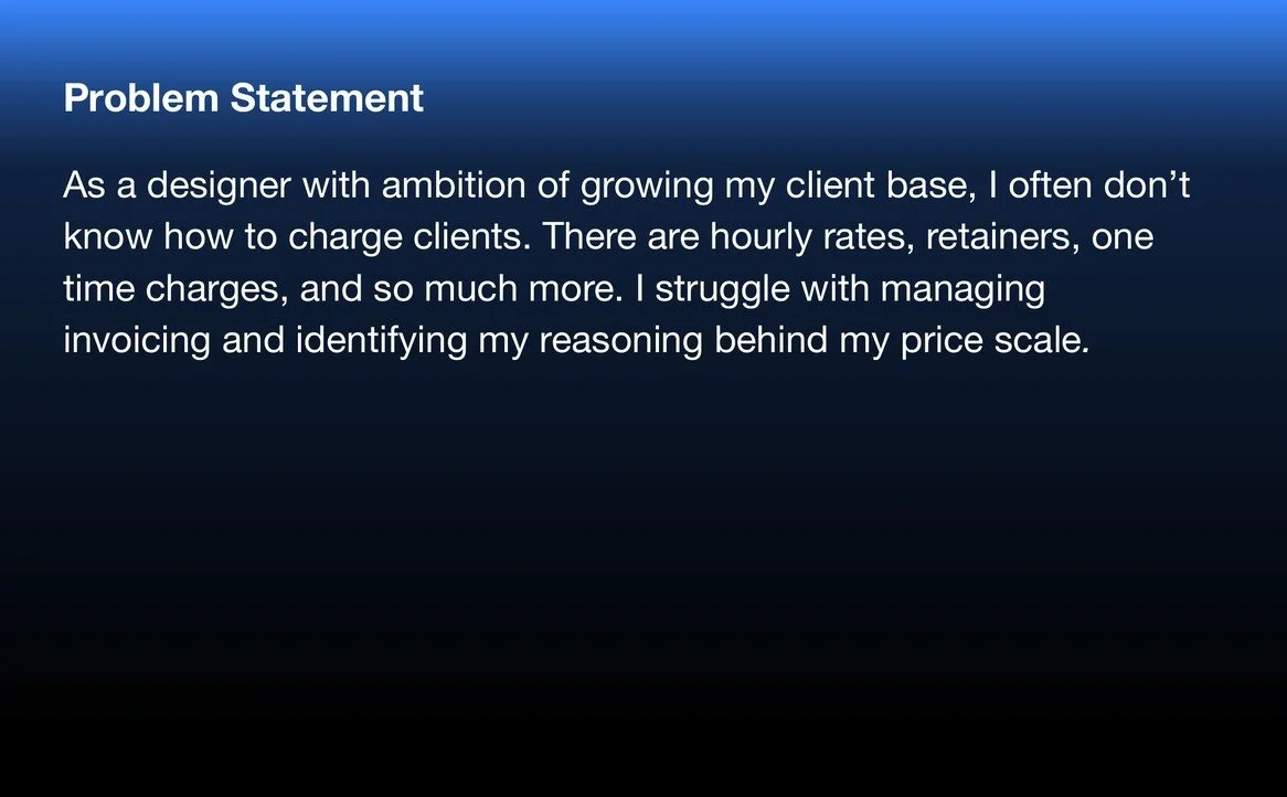
I planned 30-minute think-aloud sessions around three goals: users should be able to review project details, accept or reject a project, and use AI to support that decision. I prioritized utility — plenty of apps handle invoicing, but none bridge the confidence gap between pricing and negotiating.
Crazy 8s & Low-Fi Flows
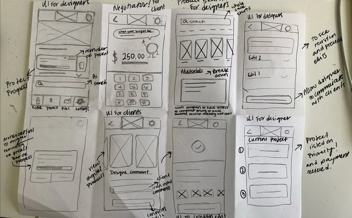
I sketched eight directions for the intake-to-negotiation flow, then mapped the strongest into low-fidelity wireframes covering request review, budget revision, and client messaging.
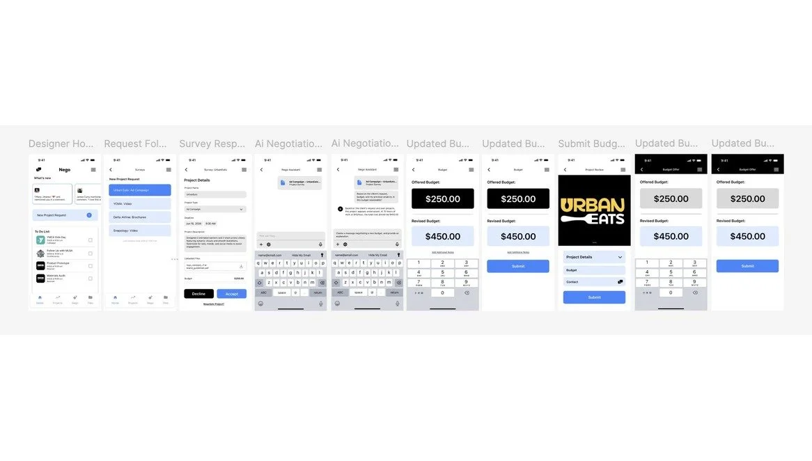
Flow: Review a request, revise the budget, and send it to the client.
High-Fidelity Wireframes
I carried the flow into high-fidelity screens — request review, AI negotiation, and updated budgets — to test with real freelancers.
I started by writing down my own pricing struggle, then tested it against other freelancers. Four steps followed, each testing a different part of the problem: a problem statement, a usability interview plan, Crazy 8s sketches and low-fi flows, and high-fidelity wireframes.
Problem Statement
As a designer trying to grow my client base, I didn't know how to charge clients. Hourly rates, retainers, one-time fees — I struggled with invoicing and couldn't explain the reasoning behind my price scale. Writing that down gave me a hypothesis to test: was I the only freelancer stuck here?
User Research
I interviewed three freelance creatives, ages 25–35, about how they price and invoice their work. I then ran three usability sessions on the prototype to see whether the flow, and the AI, actually helped.
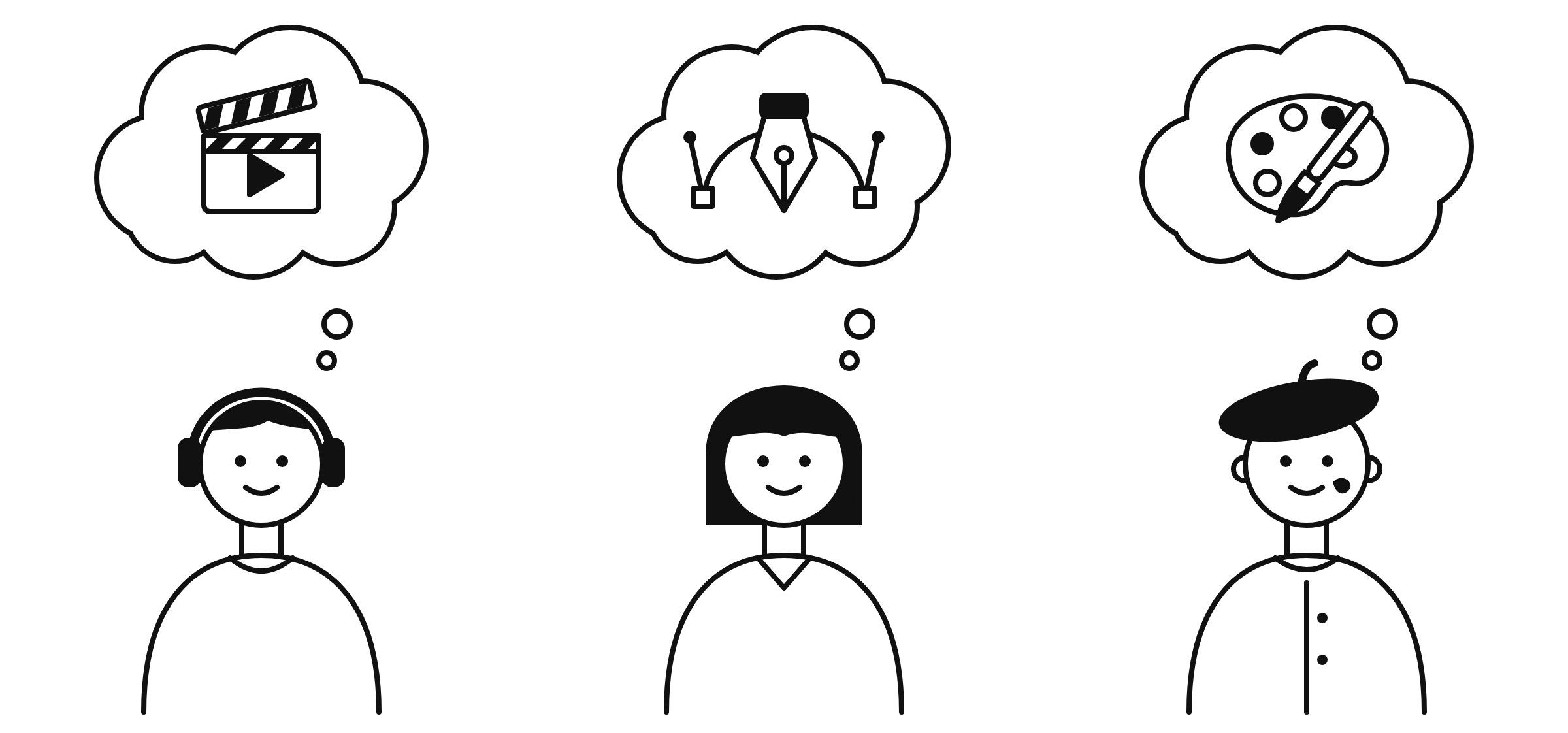
VIDEO EDITOR
Revisions eat the profit.
Cuts Reels and ads for small brands. Quotes a flat fee, then loses hours to rounds of changes no one scoped.
GRAPHIC DESIGNER
Can’t defend the number.
Designs brand kits for local clients. Knows the work is worth more, but caves when a client pushes back.
PAINTER
The hours stay invisible.
Takes commissions and murals. Prices by gut, so time, materials, and creative labor rarely make it into the quote.
Key findings that shaped the app.
Revisions and expectations cause friction.
01
Revision policies and client expectations were the biggest lessons each designer had learned the hard way.
Everyone had underpriced their work.
02
All three freelancers had undercharged at some point. Pricing doubt and a lack of guidance — not a lack of skill — led them to undervalue their time.
Clients don't see the hours.
03
Freelancers underestimate the time and energy a project takes, especially when clients don't understand the creative process.
Confidence is the real gap.
04
Every designer stressed valuing their skills and time, but they needed help standing behind the number.
Design Strategy
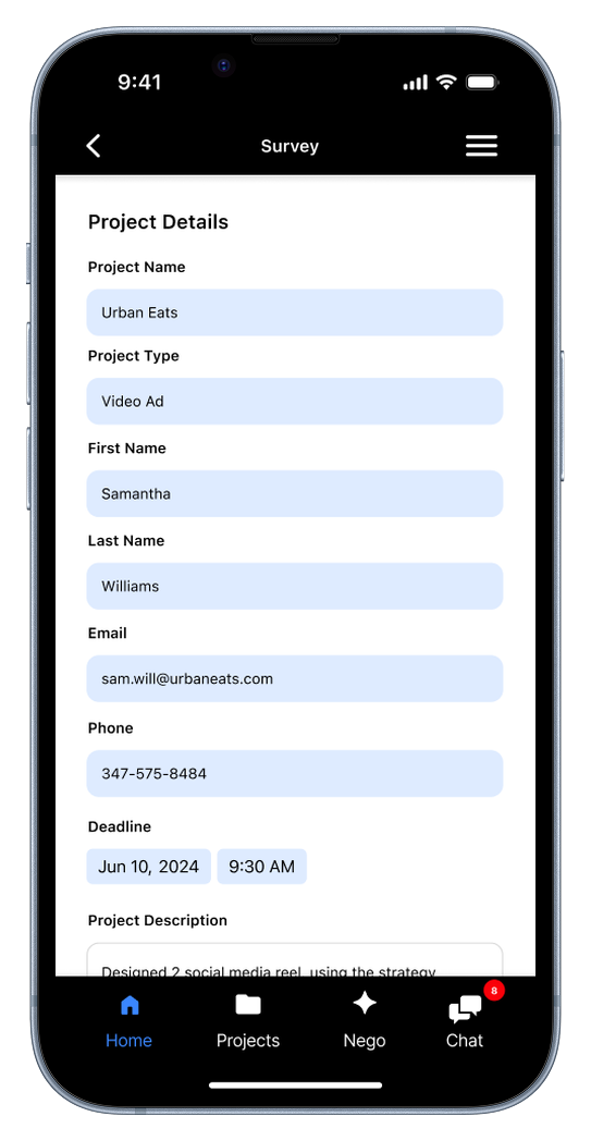
Structured Project Requests
Freelancers needed the full picture before saying yes. Every request arrives as a structured form — project type, contact, deadline, description, and budget — so accepting or declining takes minutes, not a long email thread.
The Challenge: Enough detail, not a wall of fields.
Too little information and freelancers can't judge the value; too much and clients abandon the form. The request had to capture what drives the price and nothing more.
AI Where the Negotiation Happens
In testing, no one opened the standalone AI negotiator. Their instinct was to talk to the client. So Nego AI moved onto Home and into every client chat, ready to explain a budget with reasoning based on time, scope, and past jobs.
The Challenge: Help without sounding automated.
Freelancers didn't want clients to think their replies were written by a bot. The assistant suggests reasoning they can tailor and send in their own voice.
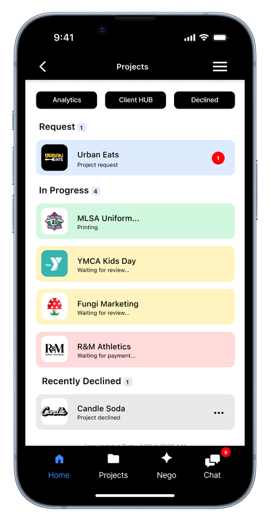
Projects
Requests, in-progress, and declined work, color-coded by status so nothing slips.
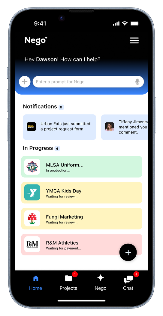
Home
Notifications and in-progress work sit under a Nego prompt bar, so help is always one tap away.
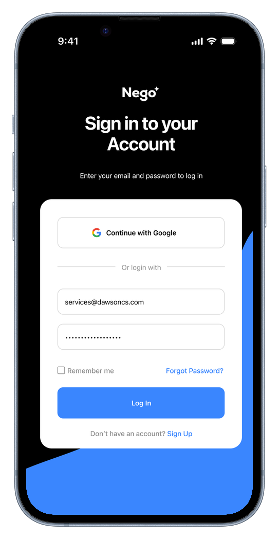
Sign In
Freelancers sign in with Google or email, so getting to their projects takes one step.
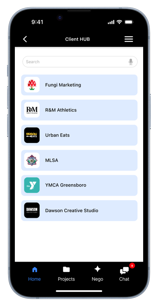
Client Hub
Every client in one searchable list, from local brands to recurring accounts.
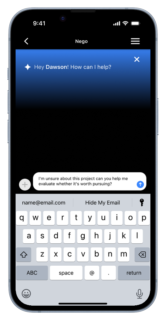
Nego in the Chat
Ask whether a project is worth pursuing, and get reasoning you can share with the client.
Project Request
Each request lands with type, contact, deadline, and budget, ready to accept or decline.
The Screens
Each screen removes a step from the pricing decision. Requests arrive structured, projects are sorted by status, and every client has a home for their details. When a freelancer is unsure, Nego AI is there on Home and in the chat to help them explain the number, not just send it.
Validation
Testing came from three moderated think-aloud sessions with freelance creatives. I wanted to know whether the request flow made pricing decisions easier, and whether freelancers would turn to AI when they were unsure.
Every participant found Nego valuable and easy to navigate, but none of them used the AI negotiator on their own.
AI NEGOTIATOR
0 of 3 used it unprompted
PARTICIPANTS
3 freelancers
30-min think-alouds
TESTING
3 usability tests
moderated and recorded
TASKS
4 scenarios
review, decide, resolve, explain
What testing showed.
The request flow worked.
01
Every participant found and reviewed the Urban Eats request without help. One looked at the scope and said it was three days of work for $250 — exactly the judgment call Nego is built for.
Nobody reached for the AI.
02
When unsure about value, participants' first instinct was to message the client, not ask AI. The design wasn't guiding them to the negotiator.
The home screen felt too plain.
03
Participants wanted stronger branding, a dark mode, and categorized file uploads. For a tool built for designers, the design itself has to sell it.
6
✓
✓
✓
Screens shaped by real freelancers
A validated concept
All three testers called Nego valuable and much needed for freelancers.
AI placed where it's needed.
Nego moved from a separate screen onto Home and into client chat.
A clear next round
Retest the AI integration, finalize brand guidelines, and make every screen clickable.
Reflection
As a designer, I assumed freelancers would turn to AI when they were uncertain. Testing proved otherwise — every participant's first instinct was to talk to the client. A feature existing isn't the same as a feature being found.
That changed the product. Instead of asking people to go looking for help, Nego now brings its reasoning into the conversation where pricing actually gets negotiated.
Next, I'll run another round of usability testing to see if the AI integration is used as intended, finalize the brand identity, and make the full iOS prototype clickable.