

What would it take to trust a stranger with your fur baby?
The Challenge
Pet owners don’t book what they can’t see.
Choosing a pet sitter feels a lot like choosing childcare. Before anyone hands over their dog, they want to see where it will sleep, know who is watching, and be able to pick up the phone.
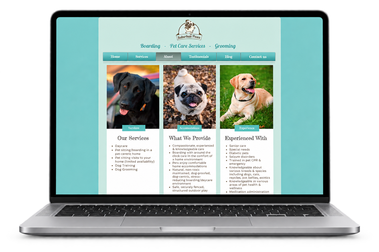
Suburban Paws is a solo-owned pet care service on Long Island, NY, and its website answered none of those questions.
Overview
Objective: learn how dog owners decide whether to trust a pet care service online, and what they need to see before they’ll book.
Suburban Paws was a three-person usability study for my M.S. in UX/UI Design at Touro University. As Team Aqua, we tested the live site with six pet owners. I led the project: the plan, the timeline, the research scope, and the final report.
There was no redesign at the end, just evidence: a clear, prioritized brief the business could act on.
TIMELINE
Spring 2025
M.S. course project
ROLE
Project lead & researcher
team of 3 designers
SCOPE
6 usability tests, 5 tasks
remote + in person
BASELINE
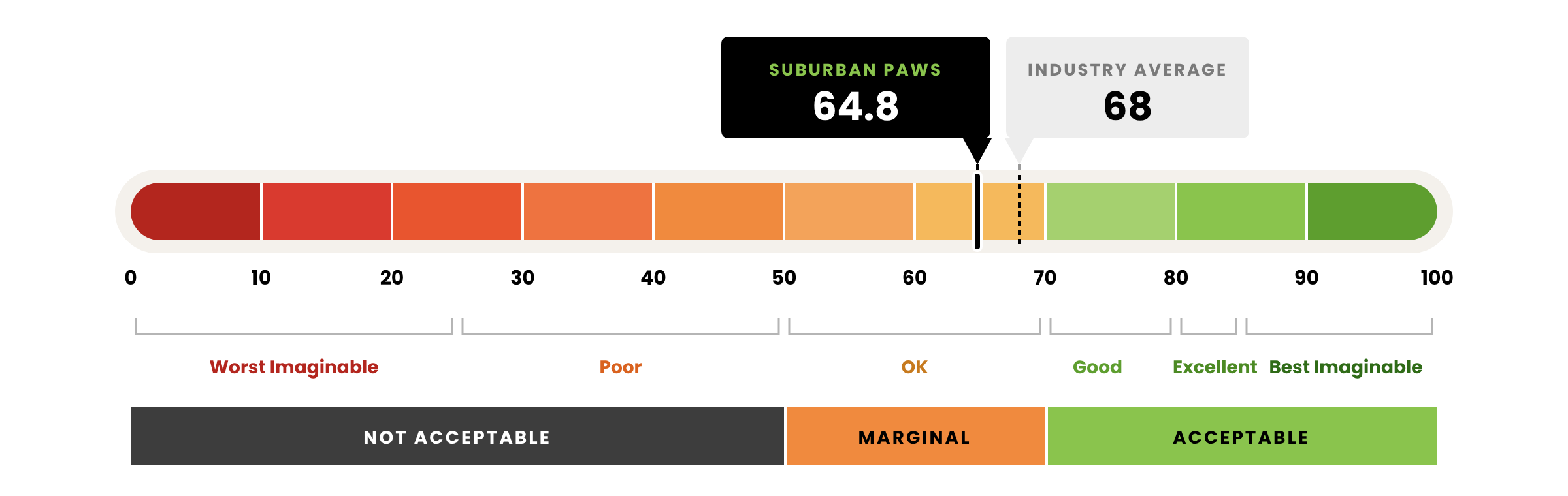
64.8 SUS score
below the 68 industry benchmark
Approach
Three designers, three different skill sets, one deadline. My job was to turn those differences into coverage instead of friction, so the team could produce one defensible set of findings on time. I ran it the way I’d run a product: set the timeline, matched work to strengths, and owned the pieces that held everything together.
01 Leading the Team
Before any research started, I built the structure the three of us would work inside.
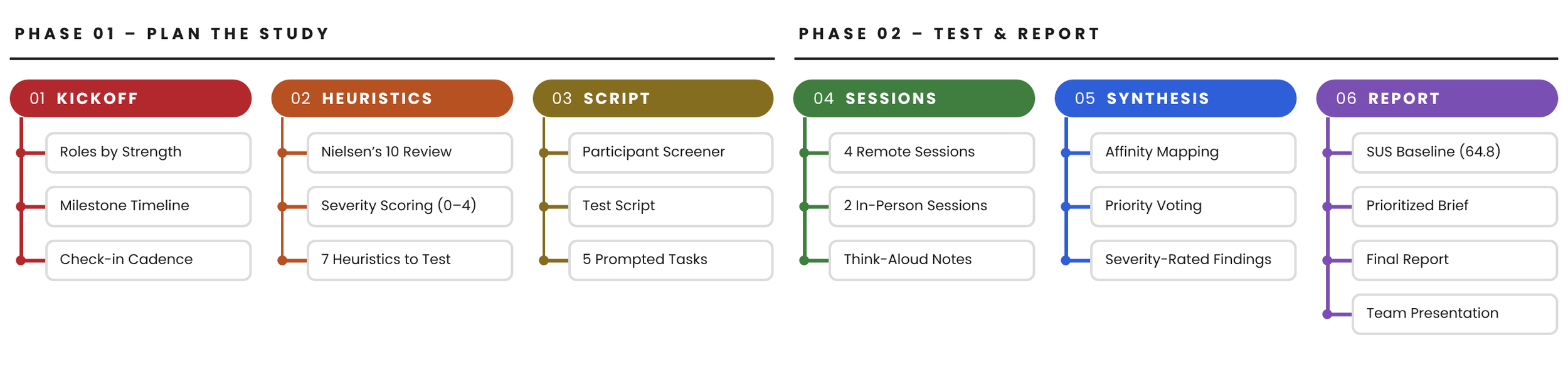
I broke the semester into milestones (screener, script, sessions, synthesis, report) and ran check-ins so blockers surfaced early instead of the night before a deadline.

How I ran the team.
Tools we used.
Research: Google Meet for sessions, Google Forms for participant info and Google Docs for research documentation.
Communication: Gmail for participant updates, WhatsApp for quick check-ins.
Brainstorming: FigJam
Transformational leadership.
Teaching showed me that people buy in when they can see what’s in it for them. So I led with energy and a shared goal: finish something we’d be proud of and grow while doing it. At kickoff, we each named the gaps we wanted to strengthen. Being honest about our weaknesses showed us we could get it done together, because each of us brought different tools.
02 Research
Before we tested with anyone, we reviewed the site ourselves. Each of us scored Suburban Paws against Nielsen’s 10 usability heuristics on a 0–4 severity scale, then we averaged our scores.
We didn’t always agree. Where our ratings split, we shared screens and walked each other through our reasoning until we reached a decision. The averages gave us a shortlist of seven heuristics to test with real pet owners.
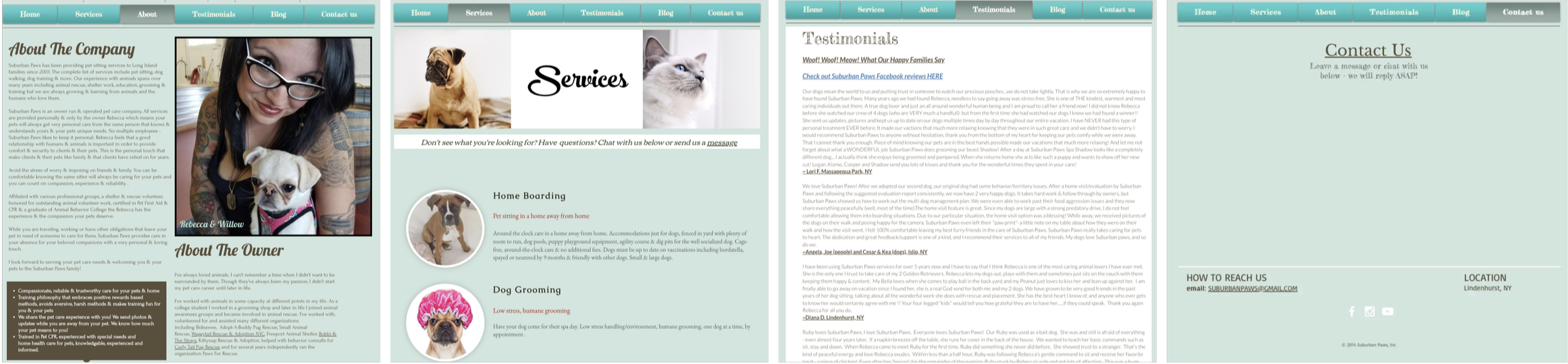
What our heuristics flagged.
No help when you need it.
Help & documentation scored 3.0. There was no FAQ, no booking instructions, and little contact info. We tested this in Get in touch and Set up a profile.
No way back.
User control & freedom scored 3.0. There was no clear way to undo an action or exit a page, and some buttons weren’t clickable. We watched for this in every task.
Too much to read.
Nothing built for return visits.
Prices you can’t find.
Aesthetic & minimalist design scored 2.66. Heavy text and mixed fonts made pages hard to scan. We tested this in See what others say.
Flexibility & efficiency scored 2.33. There were no personal profiles for repeat customers. We tested this in Set up a profile.
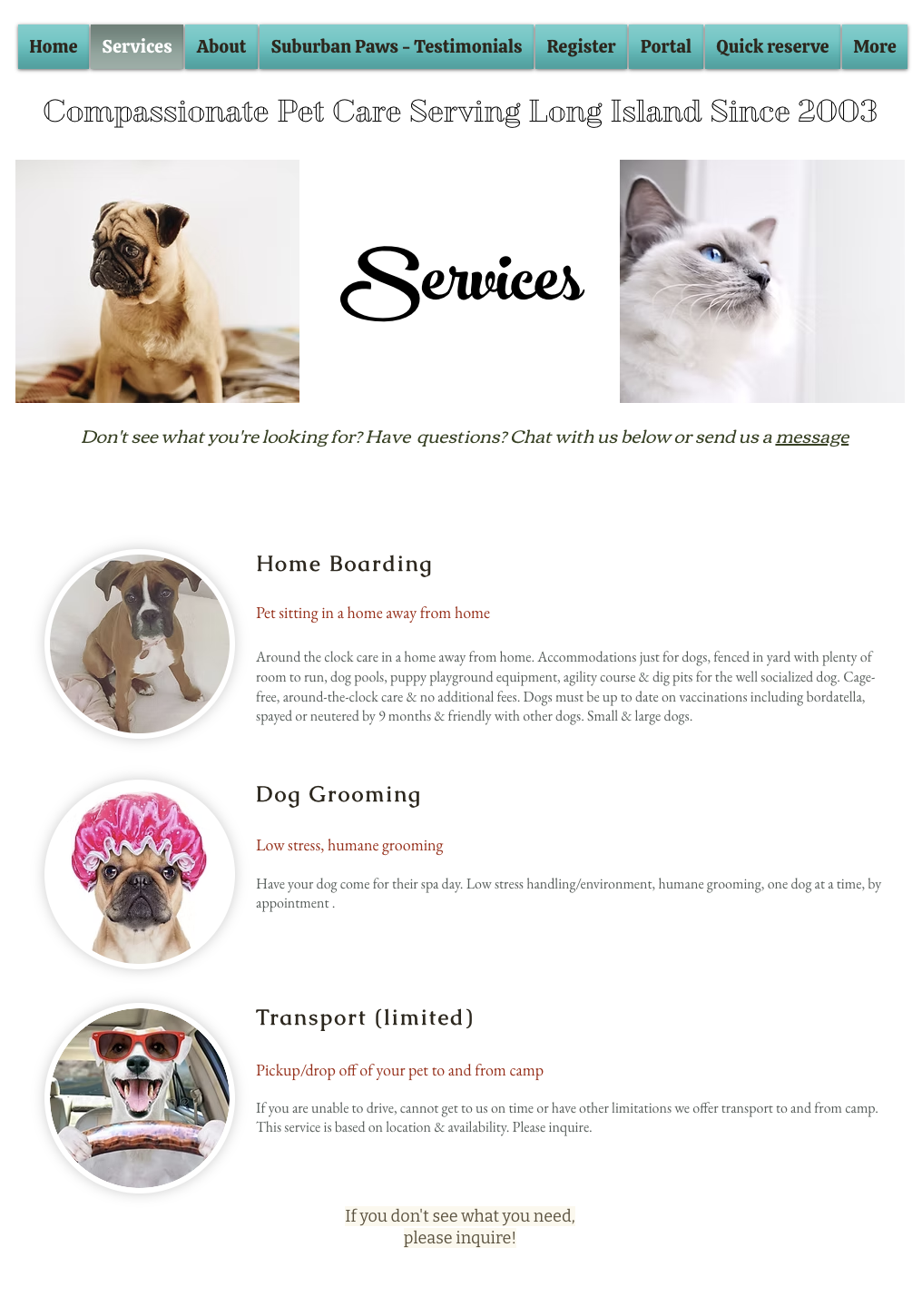
Recognition rather than recall scored 2.0. Costs and visit lengths weren’t on the Services page. We tested this in Explore the services.
03 Usability Tests
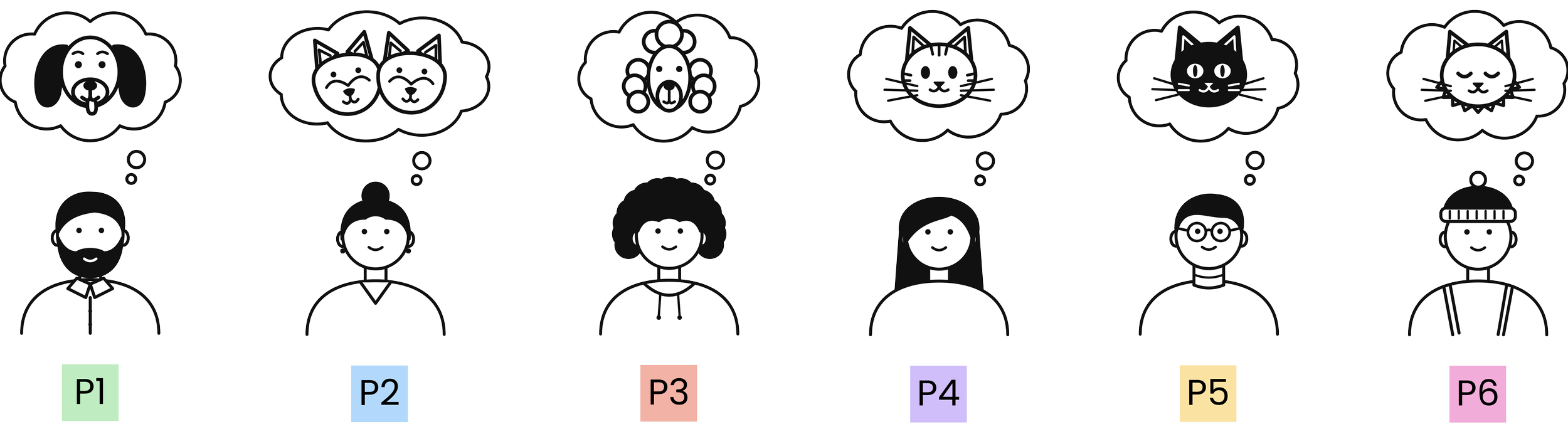
We ran six usability testing sessions with six pet owners: four remote sessions and two sessions in person where we could read body language. Every task was prompted by a realistic scenario so we could see how pet owners actually experience Suburban Paws.
PARTICIPANTS
6 pet owners
ages 24–49, from our networks
DATA
Task success, think-aloud notes plus SUS + interviews
TASKS
5 prompted tasks
explore, validate, decide
What we asked pet owners to do.
Think-aloud.
Explore the services.
You’re going away for a long weekend and aren’t sure if your pet needs overnight boarding or just daytime care. See what Suburban Paws offers and what it would cost.
Check the place out.
Before leaving your pet with someone new, you want to know where they’ll eat, sleep, and play. Find out what the space looks like and how they keep pets safe.
See what others say.
Get in touch.
Set up a profile.
We asked participants in every session to say what they were doing and why, so we could review the footage and transcribe moments we may have missed live.
METHOD
Moderated usability tests. 3 to 1
A neighbor recommended Suburban Paws, but you want a second opinion. Find out what other pet owners say about their experience.
Your pet takes medication twice a day, and you want to be sure the staff can handle it before you commit. Ask Suburban Paws your question.
You’ve done your homework, and Suburban Paws feels like the right fit. Set up an account with your details and your pet’s so you’re ready to book.
04 Key Findings
We rated every issue by severity. Two were critical: they stopped people from booking at all. Underneath every finding was trust. Choosing pet care felt like choosing childcare, and the site didn’t feel safe enough. Our heuristic review called it early: the missing contact info and hidden prices we flagged were exactly where pet owners got stuck.
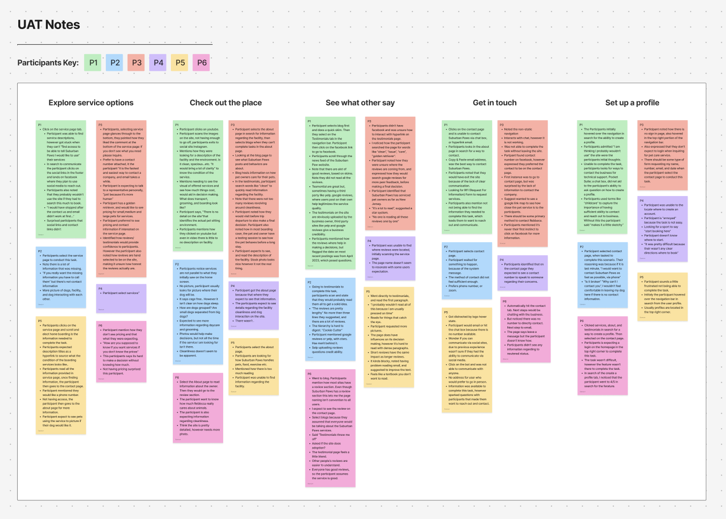
What pet owners showed us.
No way to book, no way to call.
No booking button, no inquiry form, no phone number. “I wouldn’t feel comfortable leaving my dog here if there is no contact information.”
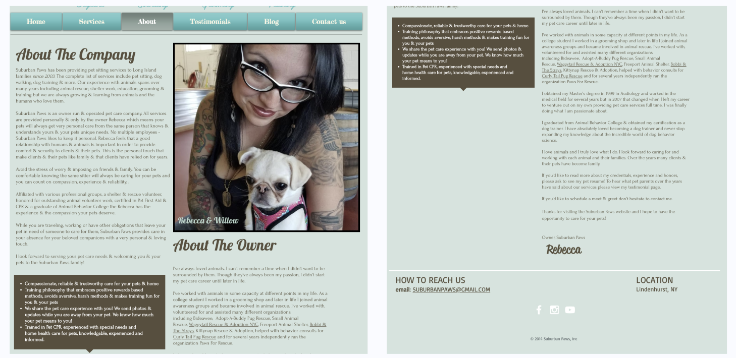
Stock photos can’t build trust.
People wanted to see the real place: the yard, where dogs sleep, what it costs. “Stock photo looks nice, but it’s not the real thing.”
Hand-picked reviews read like marketing.
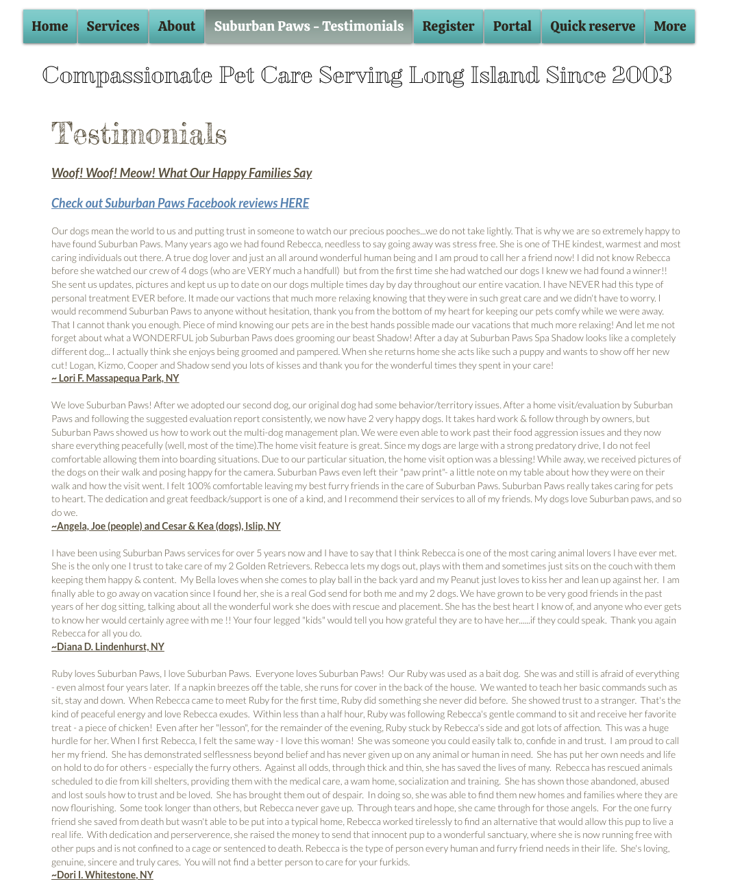
All-positive testimonials felt staged. People wanted Google or Yelp ratings instead. “No one is reading all these reviews one by one.”
05 Validate
After the tasks, each participant completed the System Usability Scale (SUS). The score confirmed what the sessions showed: the site was usable, but it wasn’t earning trust. A 64.8 gives Suburban Paws a measurable baseline for any redesign to beat.
What the numbers showed.
Easy to use, not worth returning to.
Participants rated the site easy to use (4.3 out of 5) and quick to learn (4.3). But “I would like to use this site frequently” scored lowest of any item, at 2.7. They could get around; they just didn’t want to come back.
The pieces didn’t connect.
“The functions were well integrated” averaged just 2.8 out of 5. That matches the loop we watched in sessions: Services → Contact → About, hunting for details each page left out.
Confidence was split.
Individual scores ranged from 30 to 95. Three participants rated the site above 80, while one scored it 30 and agreed they’d need technical help to use it. “I felt very confident using the website” landed in the middle, at 3.6 out of 5.
06 User Persona
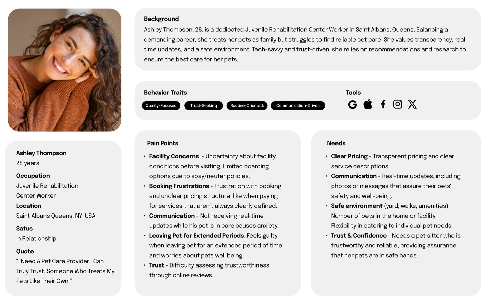
Our objective came down to one question: how do pet owners build trust, and what do they expect to see before they’ll book? Ashley is our answer. She pulls together what six pet owners told us into one person a redesign has to win over, and her needs set the terms for where that redesign should start.
07
✓
✓
✓
Where a redesign should start
Make booking and contact obvious
A “Start Booking” button in the nav, on Services, and on Contact, plus a phone number and email in the header or footer of every page.
Show the real place and real prices
Photos and video of the facility and pets in care, price ranges by dog size, pet requirements, and an FAQ.
Make reviews credible
Google or Yelp reviews, star ratings, and quotes cut to two or three sentences.
Reflection
Leading Team Aqua taught me that managing a design project isn’t about splitting work evenly. It’s about splitting it well. Three designers with different strengths cover more ground than three who are good at the same thing, but only if someone makes those differences visible and plans the work around them.
The hardest part wasn’t the research. It was keeping three schedules, considering three working styles, and three writing voices pointed at one deadline. Owning the project scope and the research framework meant the team spent its energy on the research instead of logistics.
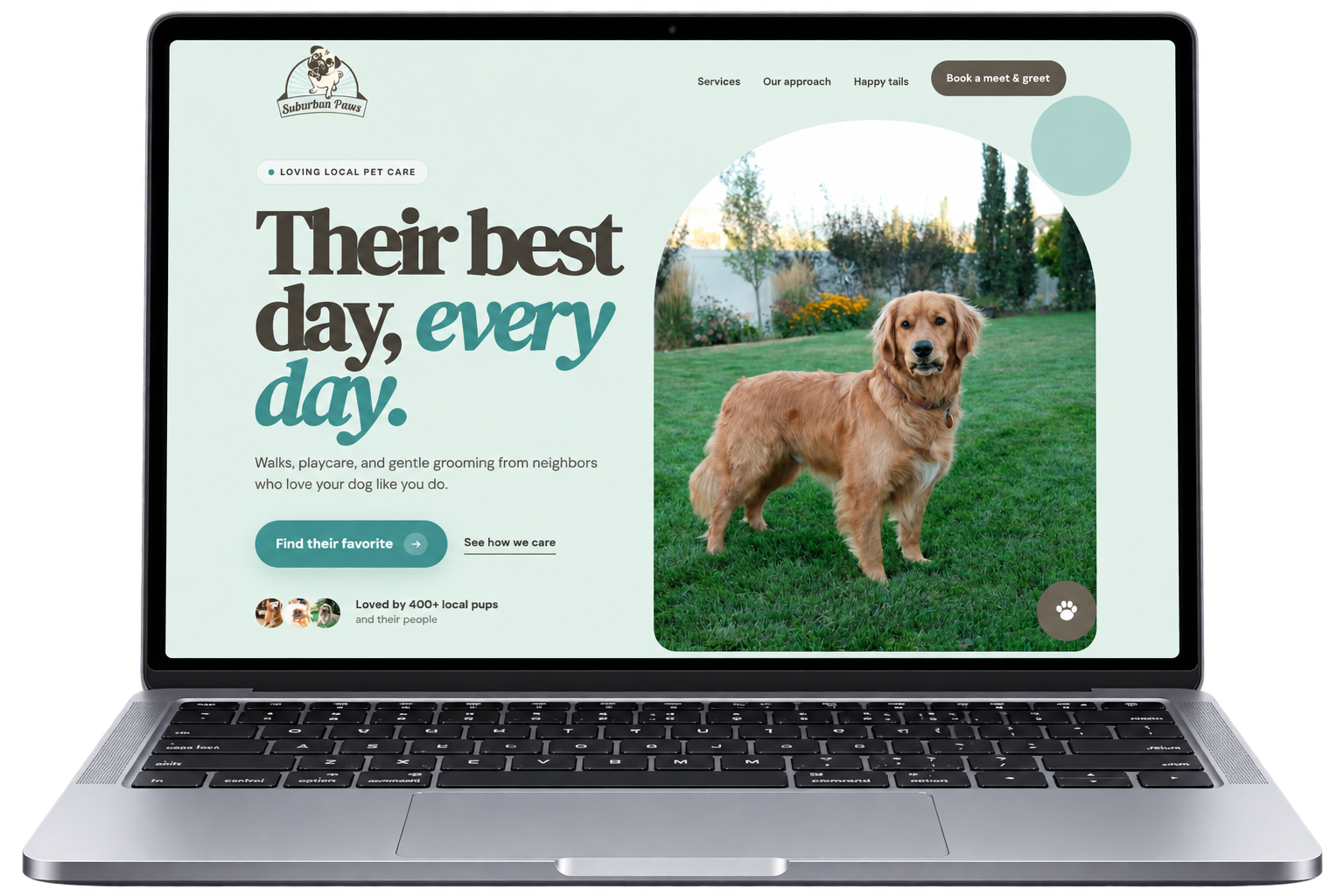
This project ends at research, by design. What it leaves behind is a prioritized brief and a 64.8 SUS baseline to beat. A redesign that tests these recommendations is next.