

What if deciding what to cook was easy?

The Challenge
Deciding what to cook is hard.
Everyday home cooks face a recurring decision: what can I make with what I have? Between limited ingredients, time, budget, and personal preferences, finding the right meal can become harder than actually cooking it.
Most recipe platforms assume you already know what you’re looking for. But the hardest part often happens before search: deciding what to make.
Overview
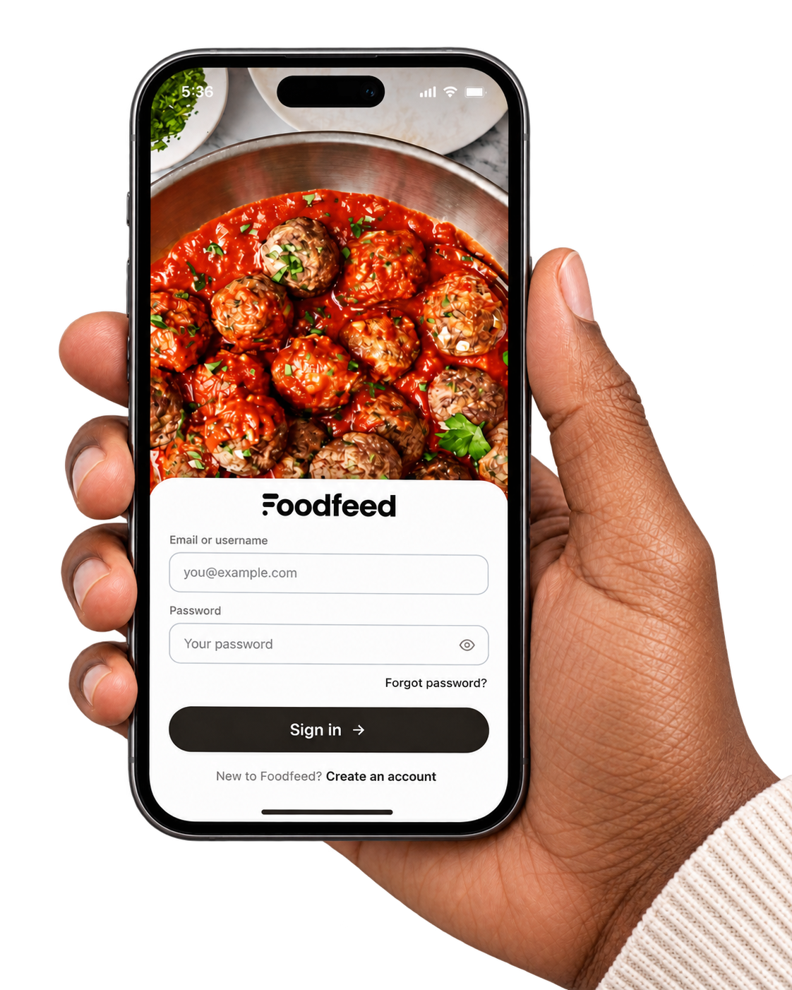
Foodfeed is an iOS app for home cooks who want to cook but can’t decide what to make. It ranks recipes against the way each person actually eats — diet, allergies, dislikes, and what’s already in the kitchen — so the feed only surfaces meals they can realistically make.
Most recipe apps start with the dish. Foodfeed starts with the cook.
TIMELINE
15 weeks to deploy
M.S. Thesis
ROLE
Sole designer & researcher
built with Claude Code
SCOPE
14 screens, one design system
research → deployed build
IMPACT
89.2 SUS score
above the 68 industry benchmark
Approach
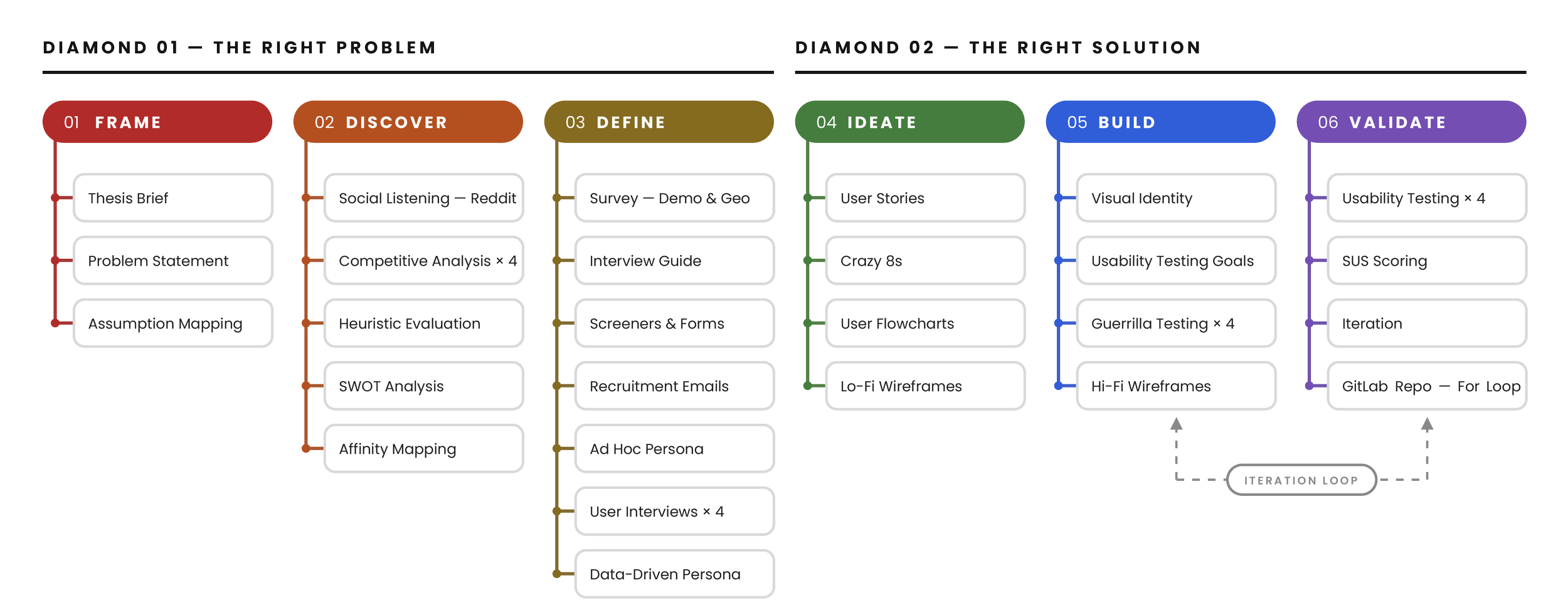
I paired User-Centered Design with Design Thinking. With 15 weeks to research, design, build and present, the real skill was knowing when to explore and when to commit.
01 Discovery
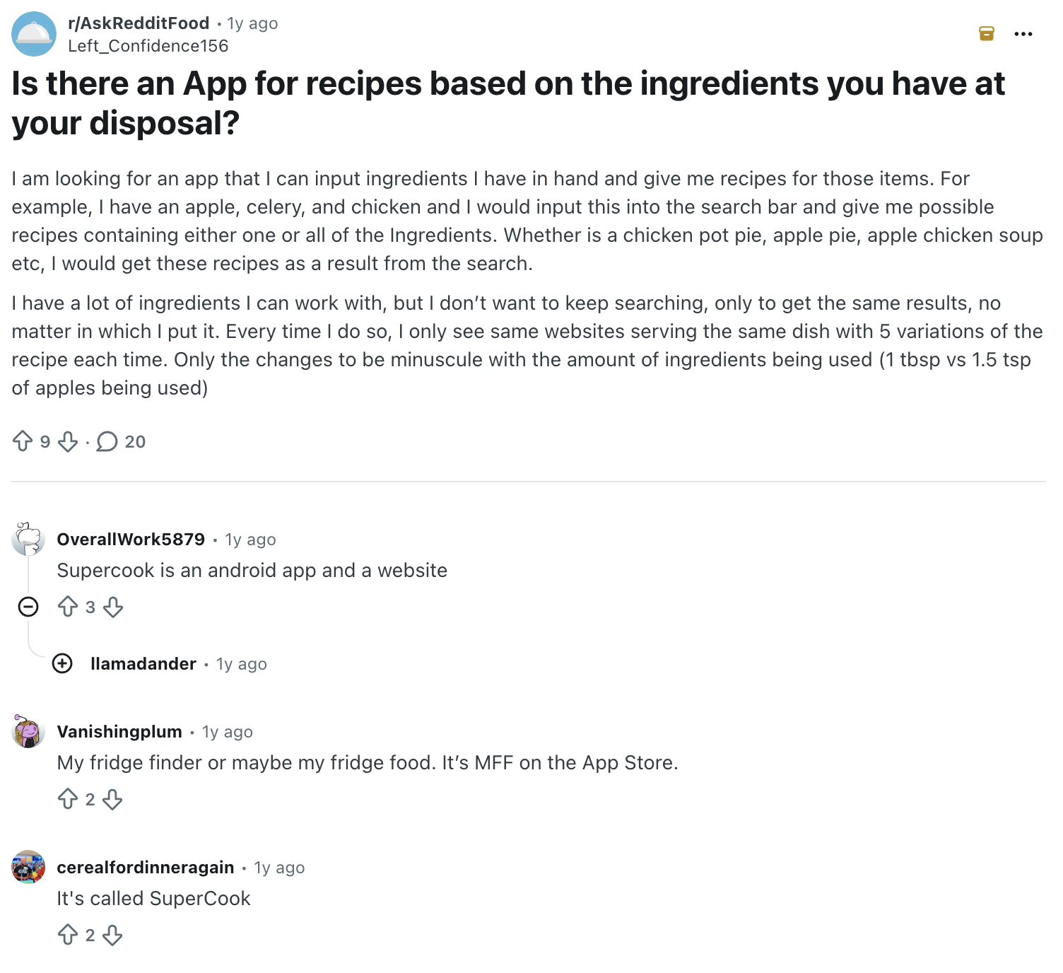
Social Listening — Reddit
Reddit let me hear anonymous home cooks in their own words. It surfaced four apps they actually use and the gaps they called out.




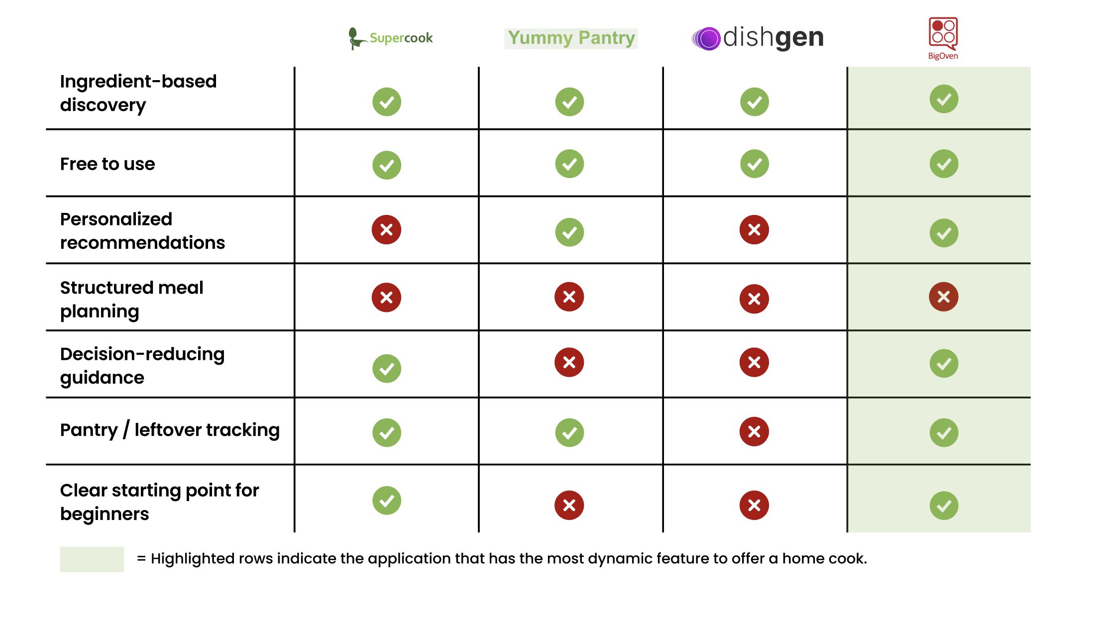
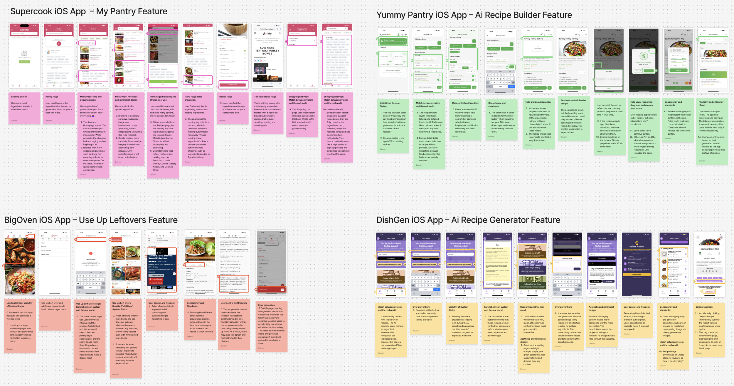
Heuristic Evaluation
I gave every recipe app the same task: find a recipe using ingredients I already had.
UAT: Find a recipe using ground turkey and save it.
SWOT
A SWOT analysis placed Foodfeed in the recipe app market and named BigOven as the competitor to beat.
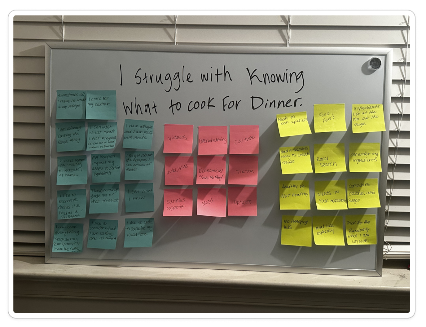
I started by separating what I assumed from what I could prove. Five methods followed, each testing a different part of the decision: assumption mapping, social listening, a heuristic evaluation of the apps home cooks already use, a SWOT analysis of the market, and interviews with three home cooks.
Assumption Mapping
Before any research, I wrote down my own assumptions so I could test whether I was the only one struggling to decide what to cook.
02 Research
I interviewed three participants to understand how they discover, save, and return to recipes. Those conversations became the user persona that directed the solution.
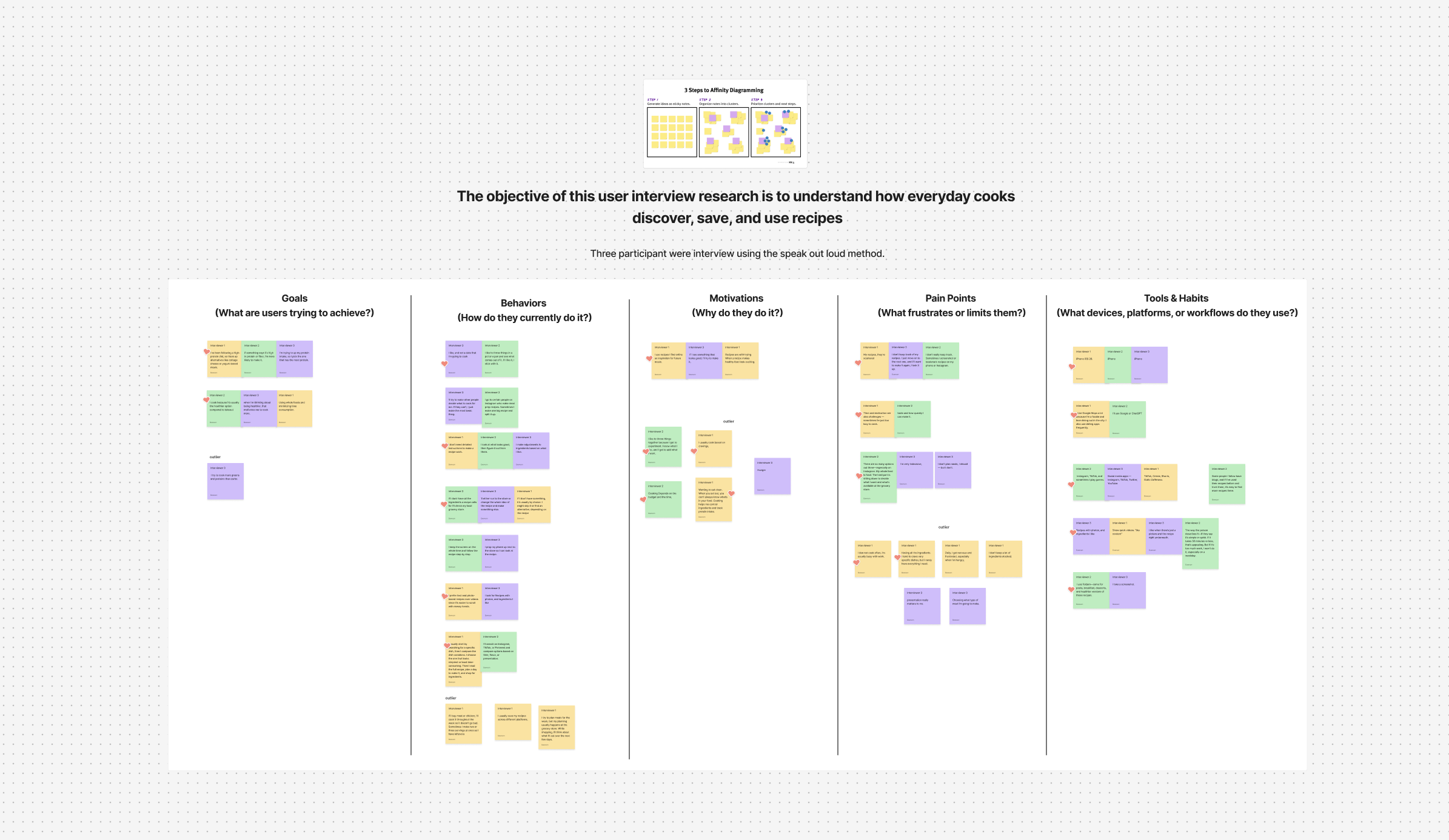
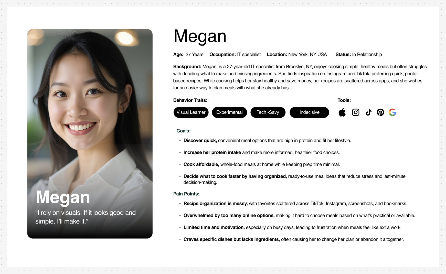
Key findings that shaped the app.
01
Home cooks don’t start with a recipe.
Home cooks eat with their eyes.
Home cooks start with what they already have, what they’re craving, or what fits the time they’ve got.
02
Constraints shape the decision.
Dietary preferences, allergies, health goals, and available ingredients all influence what ends up on the plate.
03
04
More choices don’t always mean better choices.
Current recipe apps offer options, but home cooks are often left to sift through endless recipes to find one that fits their needs.
Seeing food on a screen sparks cravings and motivates home cooks to make it.
03 Strategy
Algorithmic Recipe Feed
Home cooks kept naming the same blocker: food restrictions. So the feed ranks recipes against each user’s stated preferences, cutting the noise down to meals they can actually make.
The Challenge: Restrictions aren’t one list.
Religion, allergies, health goals, and plain dislikes all shape what belongs in a feed. Building a database flexible enough to cover that range, without quietly excluding anyone, was the hard part.
Familiar Interaction Patterns
Social apps are where meal ideas actually start, so I borrowed the patterns home cooks already use: scroll, save, revisit. Discovery needed no learning curve.
The Challenge: Inspiration is everywhere; holding onto it isn’t.
Recipes get stranded across Instagram, TikTok, and Pinterest with no reliable way back. Foodfeed folds those three habits into one experience.
04 Design
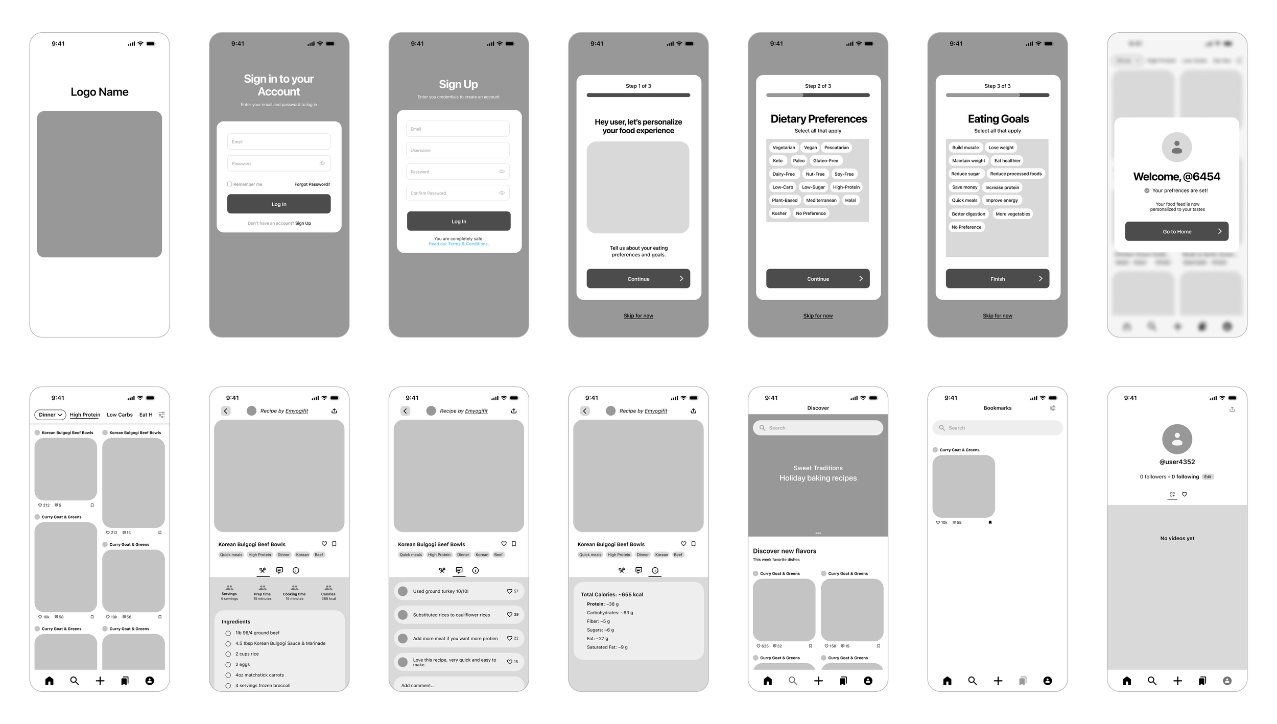
Low-fi wireframes
Before any visuals, I sketched the core flow in low fidelity: onboarding, feed, recipe, save. Keeping it rough let me test structure and order without anyone reacting to color or photos.
Guerrilla testing
Before building a hi-fi prototype, I took the wireframes to home cooks for quick, informal sessions: friends and coworkers I regularly check in with.
I wanted to answer two questions. Would home cooks actually use algorithmic search to narrow down their food decisions? And would familiar interaction patterns make Foodfeed easy to navigate? The navigation bar, card-style layouts, and discovery and search areas all borrow from the social platforms home cooks told me they already use. I wanted to hear what they made of the rough draft.
WHERE
Friends & coworkers
informal, remote check-ins
FORMAT
Remote screen share
testers pointed with their cursor
TASK
Sign up and find a first meal
talked me through each step
What testers showed me.
Allergies are their own concern.
One tester pointed out that diet style and eating goals didn’t cover allergies. Their real worry was accidentally making something they’re allergic to, which is a safety issue, not a preference.
Restrictions go beyond diet labels.
Another tester’s food restrictions came from religious values. The wireframes didn’t account for that at all, and none of my earlier interview participants had raised it either. It was a gap in how the algorithm understood meal preferences.
Home cooks want ideas, not just dinner.
TESTERS
3 home cooks
same group size as every round in the study
Depending on the time of day I caught them, testers weren’t looking for dinner or lunch specifically. They wanted good categories of food to browse. Together, these findings showed me what the algorithm was missing before I went hi-fi.
What changed
Food Allergies
Before: No wireframe addressed allergies.
After: A new onboarding step where home cooks name the ingredients they need to avoid.
Why: A tester with a gluten allergy was tired of hunting for safe recipes. They didn’t want recipes that were simply labeled gluten-free. They wanted gluten filtered out so they could trust what they were cooking.
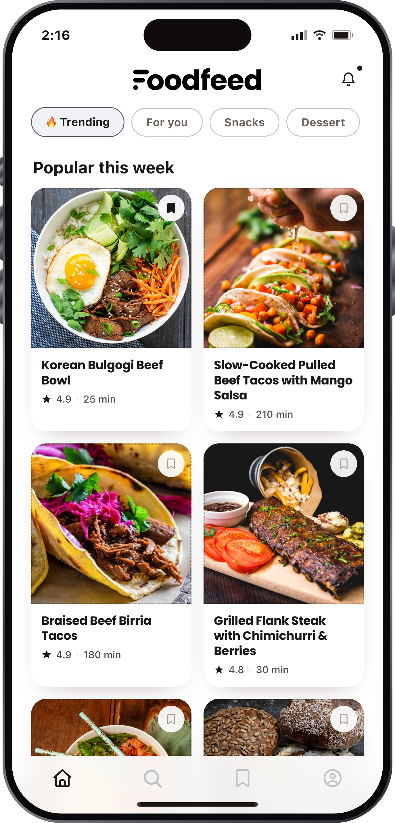
The Foodfeed
Before: The home screen only showed dinner options, a bias that came from my own habits.
After: Dinner is still there, alongside Trending, For You, Snacks and Desserts, and home cooks can edit the categories to fit them.
Why: A tester wanted ideas for breakfast, lunch, snacks, desserts and sweet treats, not just dinner.
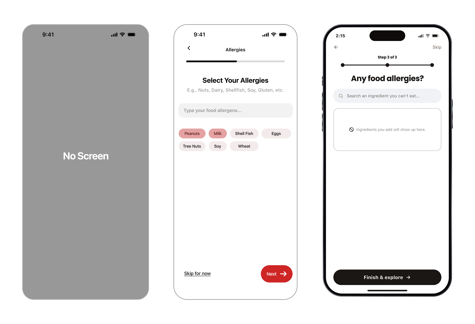
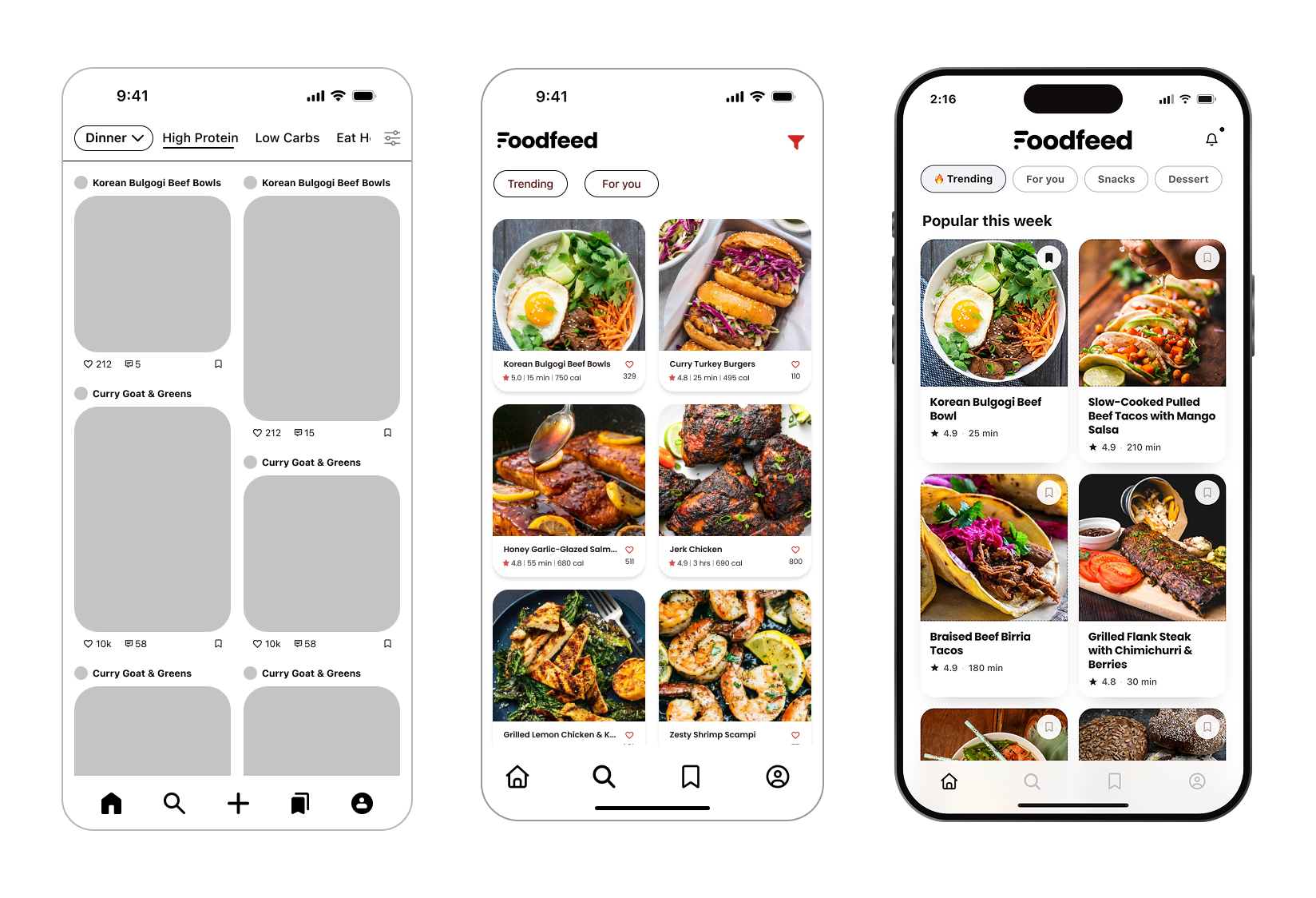
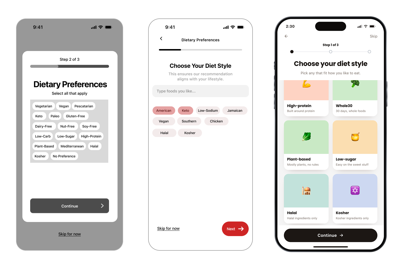
Guerrilla testing turned into these changes before anything went hi-fi. Each row follows one screen from low to mid to hi-fidelity.
Diet Style
Before: The first step toward the algorithmic feed, asking home cooks to pick a diet style.
After: Built up from low to mid to hi-fi, it now captures the categories of food each cook is looking for.
Why: Testers showed me how varied home cooks are, including restrictions rooted in religious values, so I built in most major food styles.
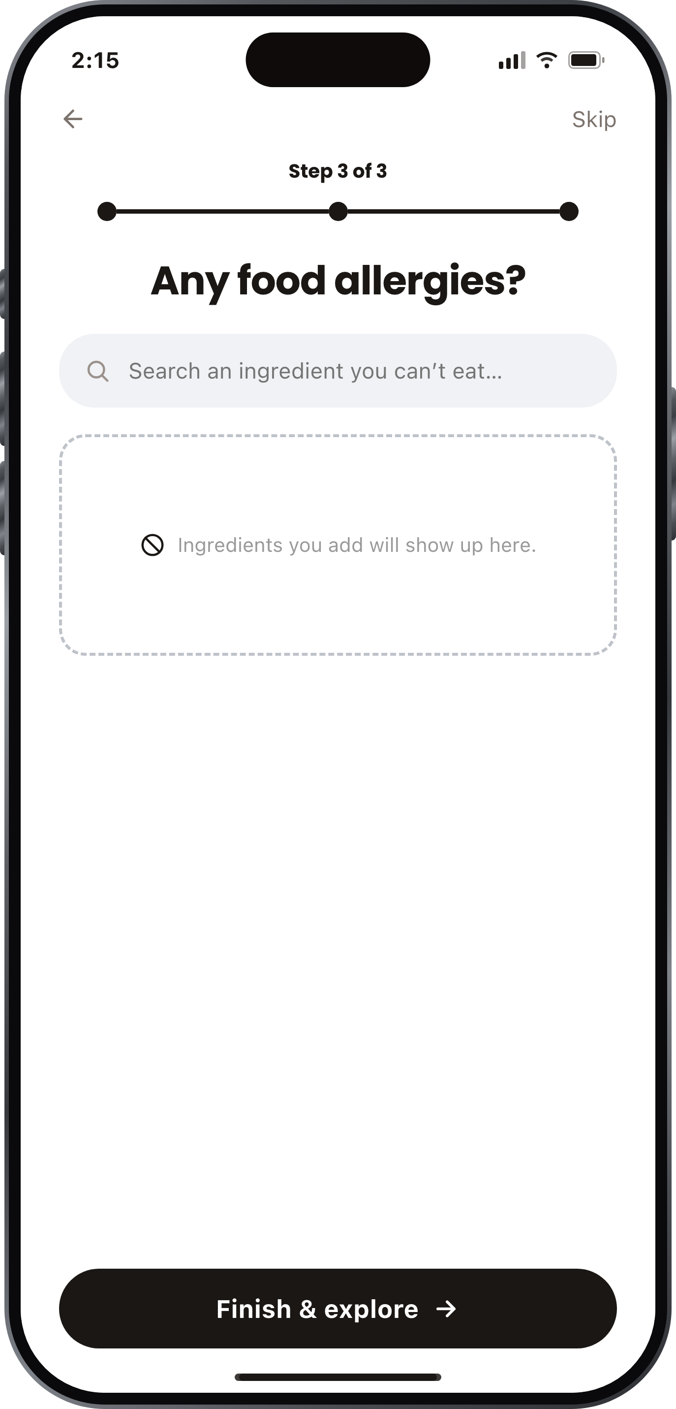
Food Allergies
Allergies can create serious recipe limitations, so I kept them separate from dietary preferences to prioritize user safety.

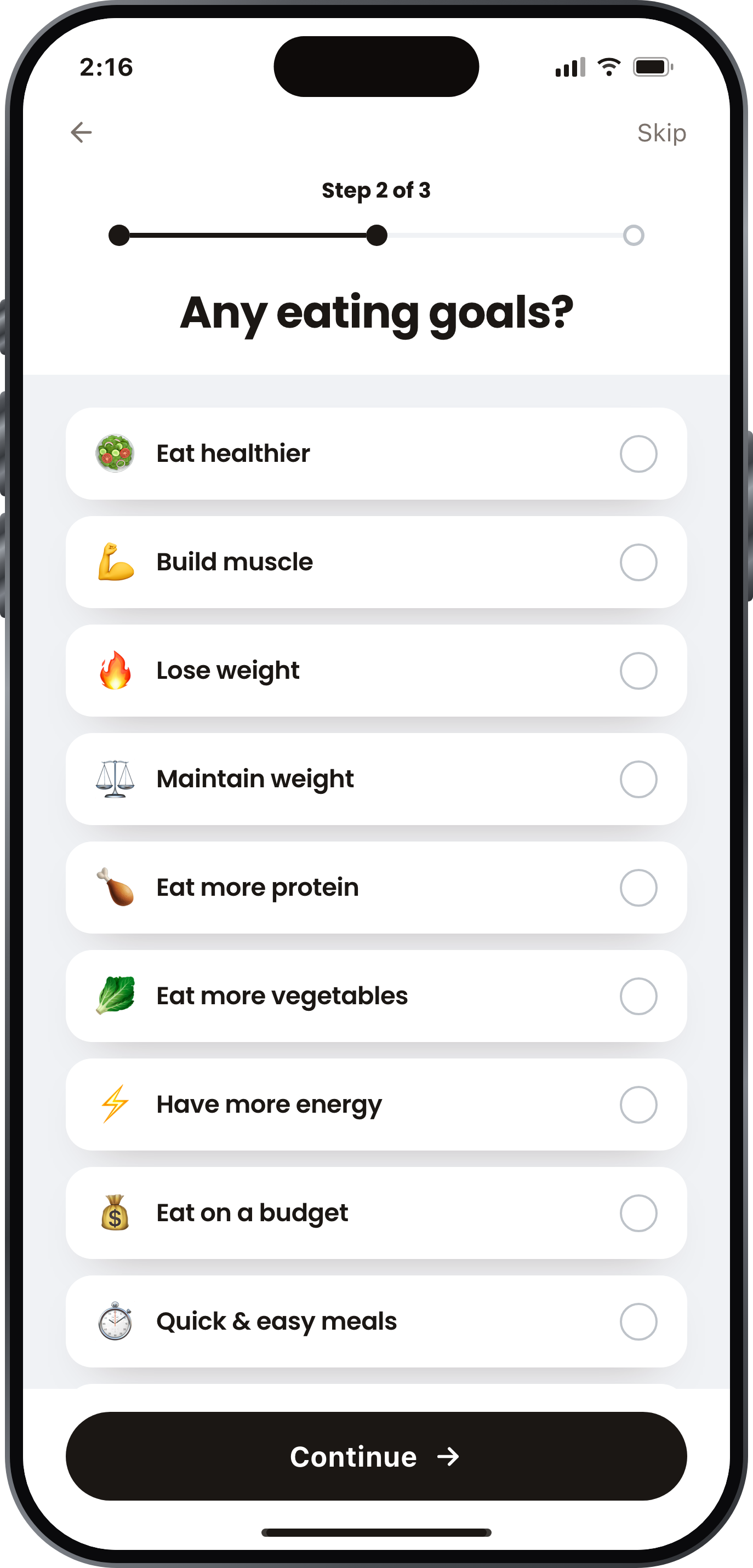
Eating Goals
Users may avoid specific ingredients based on personal preferences or past experiences, so I added a way to exclude them from recommendations.
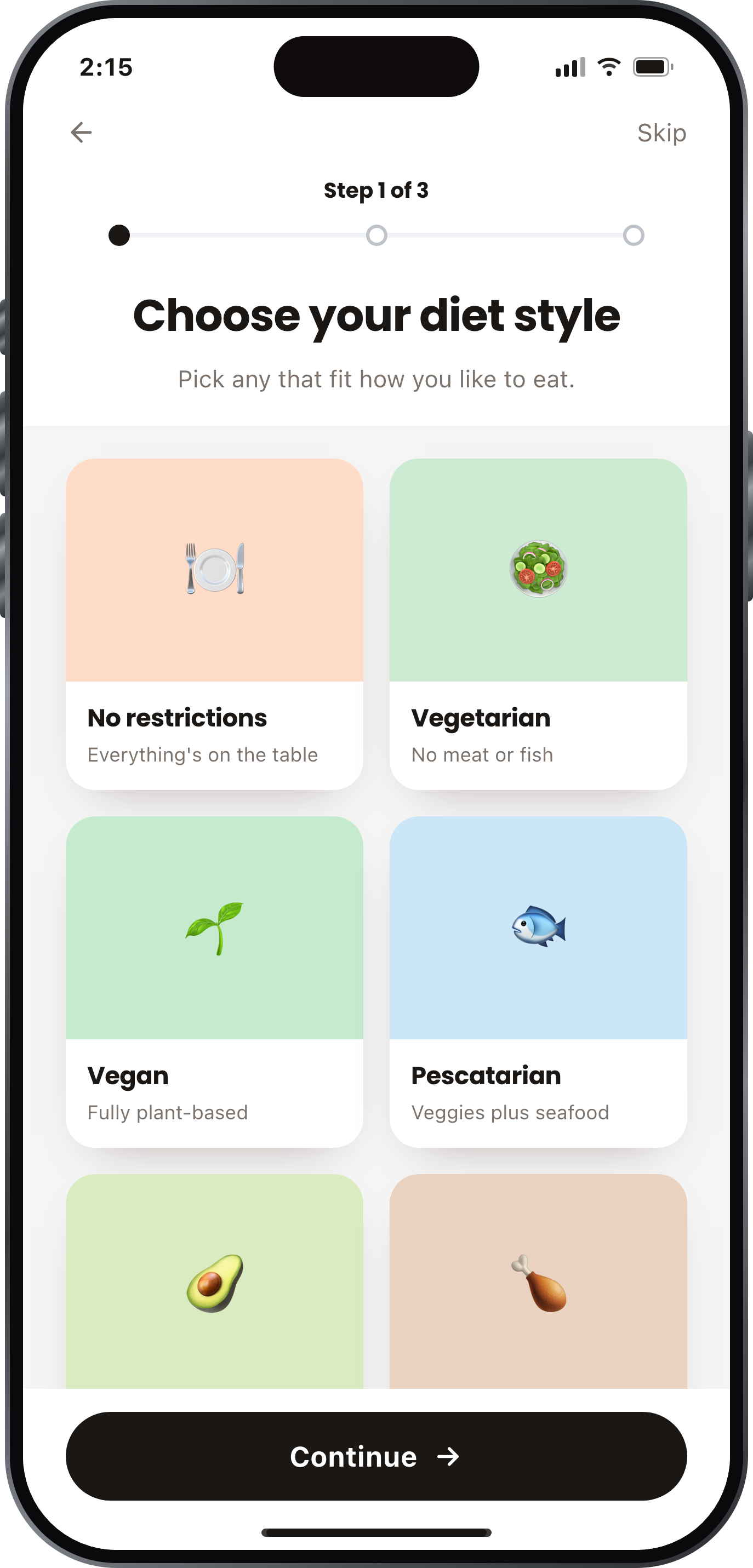
Diet Style
Users have dietary preferences that influence what they choose to cook, so I built this into onboarding to personalize recipe recommendations.
Recipe Card
Users prioritized recipes, ingredients, steps, and comments, so I structured the experience around that flow.
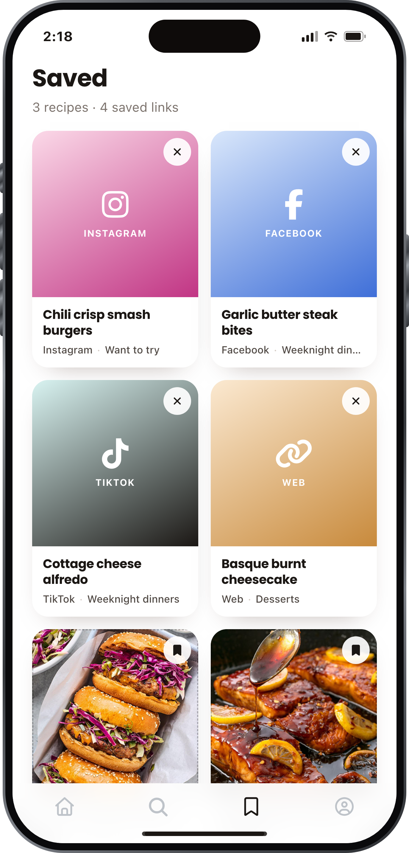
Bookmarks
Users wanted to save recipes for later, so I made bookmarking accessible inside and outside the app.
The Foodfeed
Users shouldn’t need every ingredient to cook, so I designed search around what they already have.
Hi-fi screens
Each screen removes a step from the decision. At sign-up, home cooks answer a few questions about how they eat, which lets Foodfeed rank recipes against their actual preferences from the first session. From there, ingredient search covers what’s already in the kitchen, and recipes saved from outside links land in the app instead of being scattered across other platforms.
05 Validate
Testing came in two parts: task-based sessions with home cooks, and a System Usability Scale survey. I wanted to know whether removing steps from the decision actually made the app easier to use, or whether it only felt that way to me.
Every participant rated Foodfeed above the Acceptable threshold, and none of them found it complex or difficult to use.
PARTICIPANTS
3 respondents
10-item survey, 5-point Likert scale
RANGE
82.5 – 92.5
all three above Acceptable
TESTING
3 usability tests
plus 3 guerrilla sessions
What testing showed.
Ease of use scored highest.
Every participant disagreed that the app was complex or difficult, and none felt they needed technical support to use it. The familiar scroll-save-revisit pattern did what it was meant to do: no learning curve.
Confidence lagged behind ease.
Participants rated ease of use higher than their own confidence in using the app. Knowing how something works and trusting it are not the same thing, and that gap is where the next iteration lives.
A small pool is a real limitation.
SUS SCORE
89.2 out of 100
Three SUS responses are directional, not conclusive. I’m reporting it as a signal that the direction is right, not as proof the product is finished.
3/3
✓
✓
✓
Every tester rated Foodfeed easy to use
Built around real behavior
14 screens built on how people already discover food, instead of asking them to learn a new habit.
User needs come first
Allergies, dietary preferences, and dislikes are addressed during onboarding, making exploration more relevant and safer.
Decisions backed by data
Research and usability testing informed key design decisions, creating a documented process I can carry into future product work.
Reflection
As a UX researcher and designer, I had to resist the urge to jump to solutions and instead become comfortable with ambiguity. Acknowledging my own biases made room for curiosity, empathy, and a genuine desire to test what I thought I knew and seek answers.
One limitation was the size of my participant pool. Research gets stronger with both more participants and more researchers: a larger team reaches more people, gathers richer qualitative and quantitative data, makes room for perspectives that converge and diverge, and checks the biases a single researcher can’t catch in themselves.
I’ve since started exploring AI as a tool to help fill some of those gaps — not as a substitute for real users, but as a way to challenge assumptions, explore alternative perspectives, and strengthen my research process. The goal isn’t to eliminate uncertainty; it’s to become better at navigating it.