
The Patch Is Where The Culture Lives.
The league needed a bold patch illustration system that feels athletic, recognized, and flexible enough for both digital and physical use.
YEARS
2021-2025
4 Seasons
TOOLS
Illustrator & Photoshop
Adobe CC
ROLE
Designer & Illustrator
Sole designer
CLIENT
Major League Softball Assoc.
Chicago non-profit
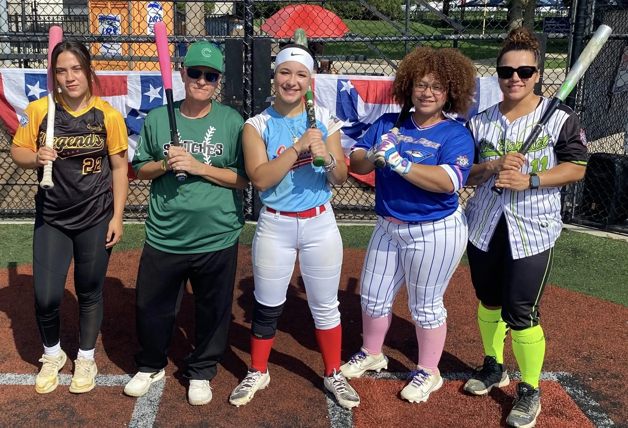
Overview
Culture Is the Heartbeat of Sportsmanship.
The Major League Softball Association is a Chicago-based non-profit bringing softball opportunities to players of all ages and backgrounds. As the organization grew, so did the need for a visual identity that truly reflected its community, not just the sport.
The goal was to design a patch system that wove together Chicago's iconic city culture, Hispanic heritage, and the spirit of softball into one unified mark, something players and fans could wear as a badge of pride.
Visual Research
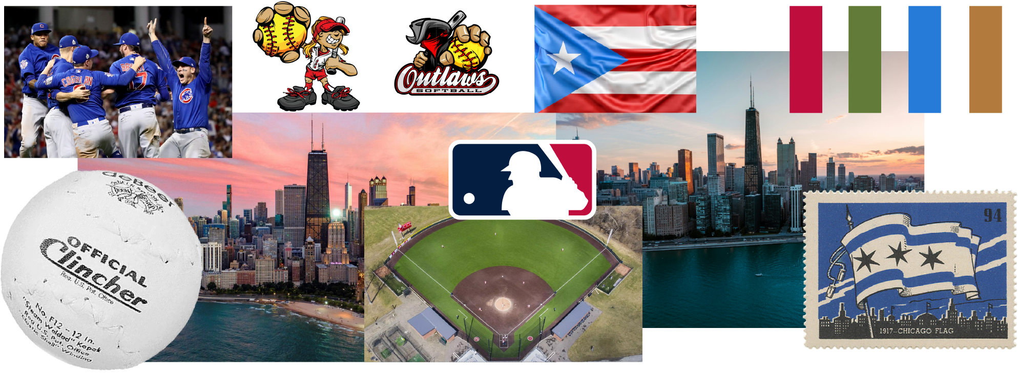
Before starting any visual design project, I make collage boards to set the tone and voice before I start sketching.
1st Place
2nd Place
3rd Place
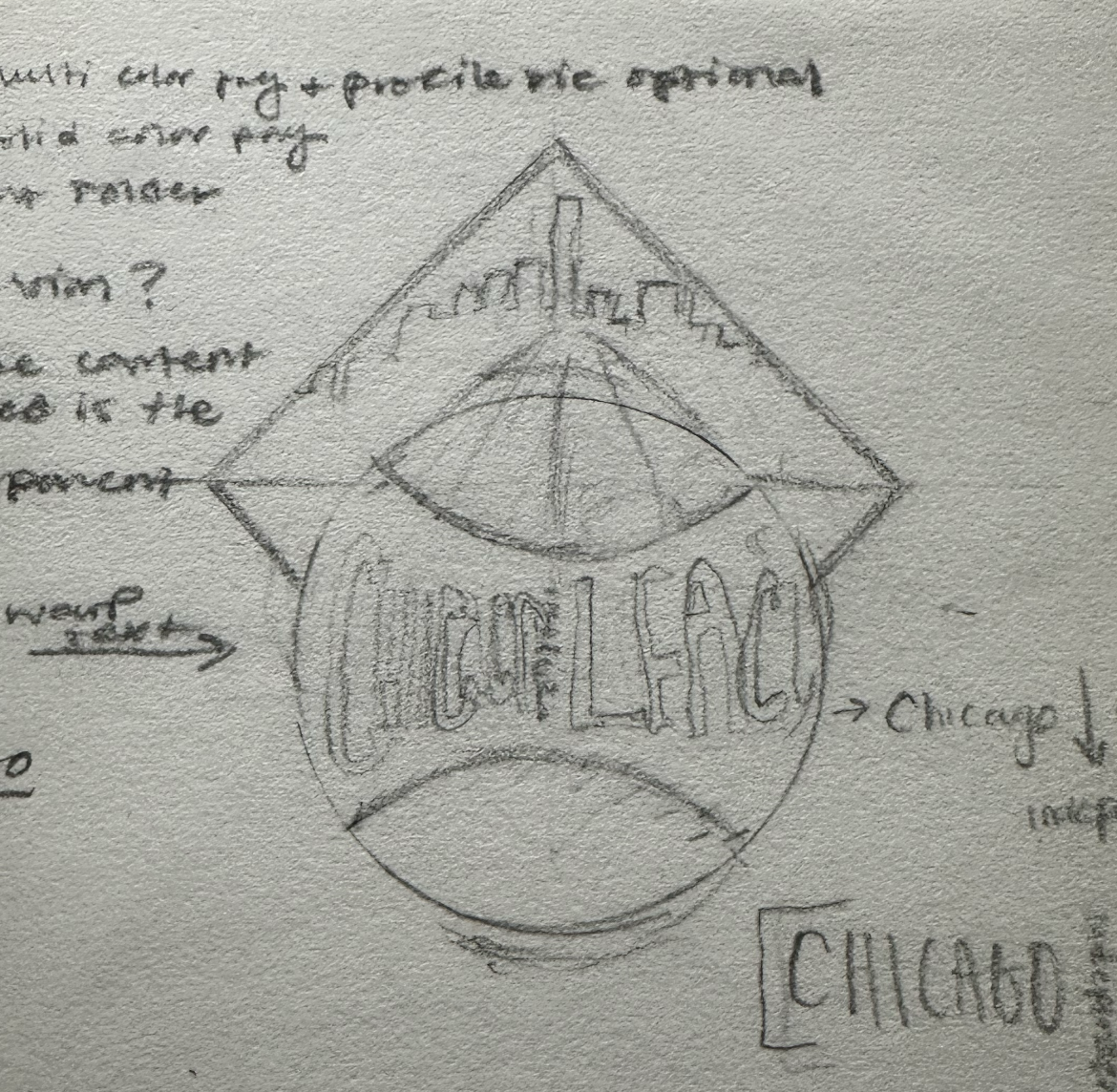
Sketches
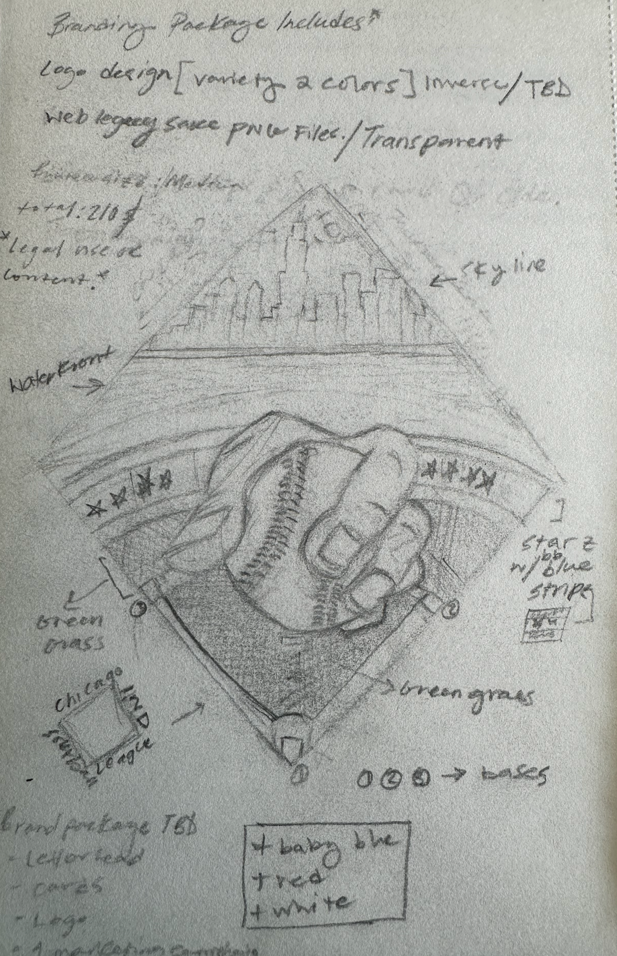
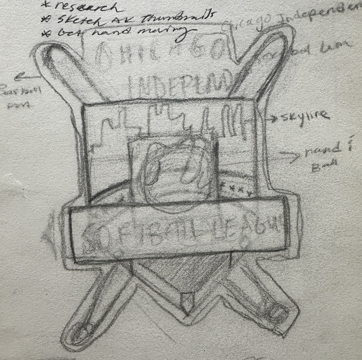
Using the visual research as a guide, I drafted three variations to show the client. From experience, I only show three logos per review. It cuts down on feedback noise and makes it easier to spot if something isn’t working.
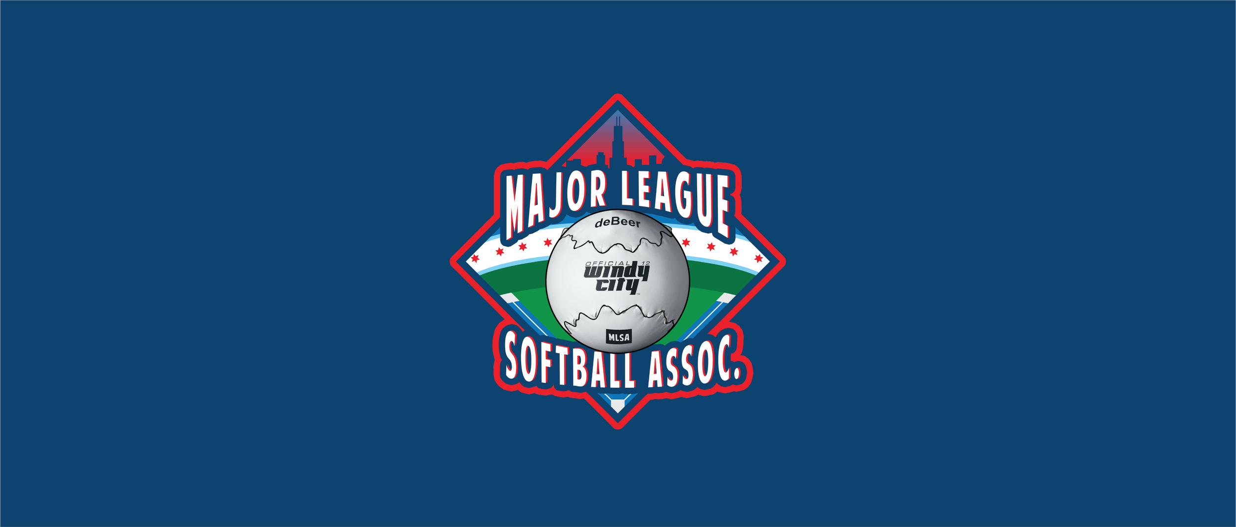
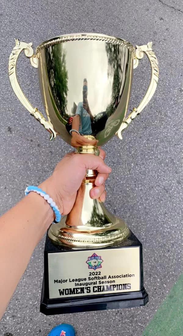
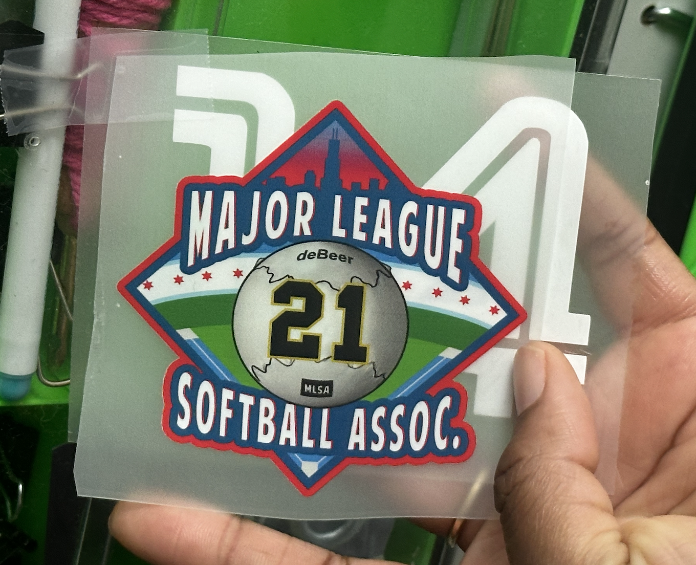
Reflection
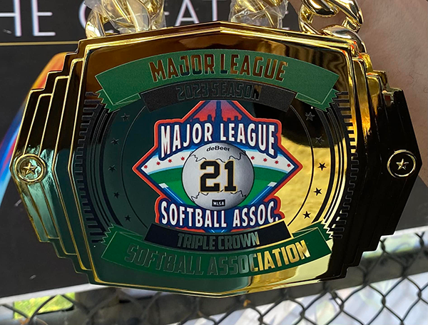
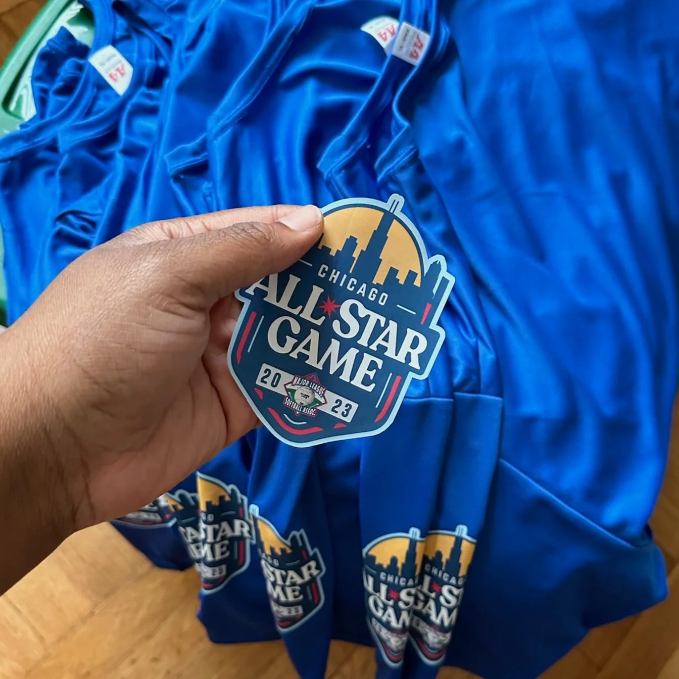
This was one of the first projects I took on after finishing my undergrad, and it showed me what I could do as a visual designer: take one piece of an identity and build it into something people wear with pride. What started as a single logo grew into patches, trophies, belts, and an All-Star Game.
The biggest lesson I learned is that failure is part of building anything great. The mistakes you make along the way are what shape you into a strong designer. This project hits home for me because MLSA feels like family. They've supported me from the very beginning.